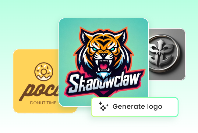
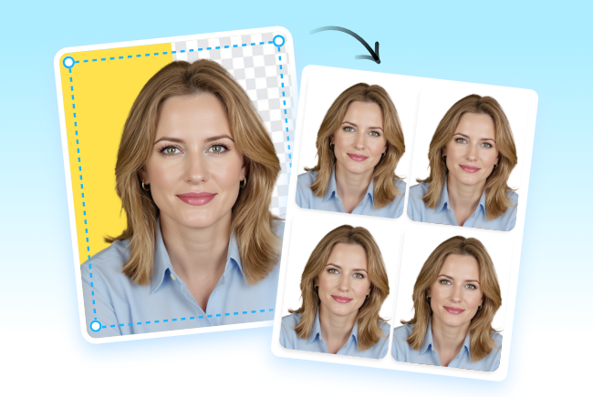
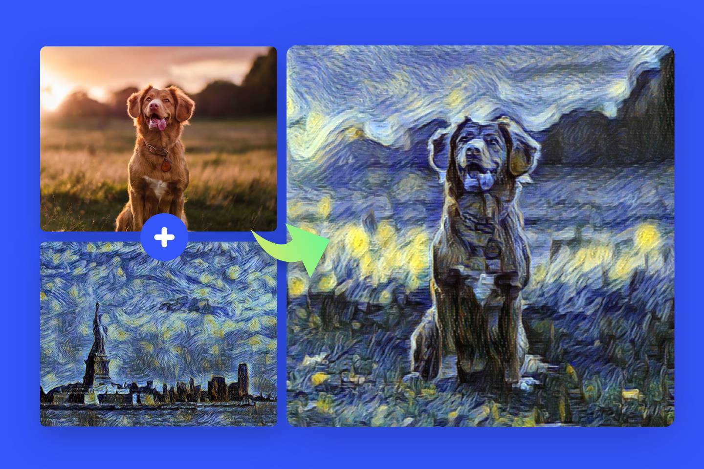
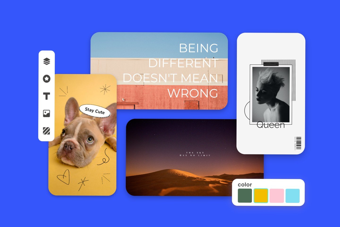
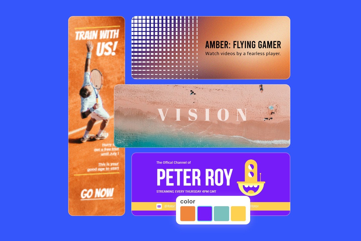
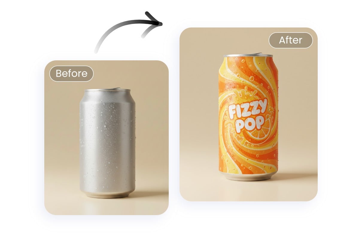
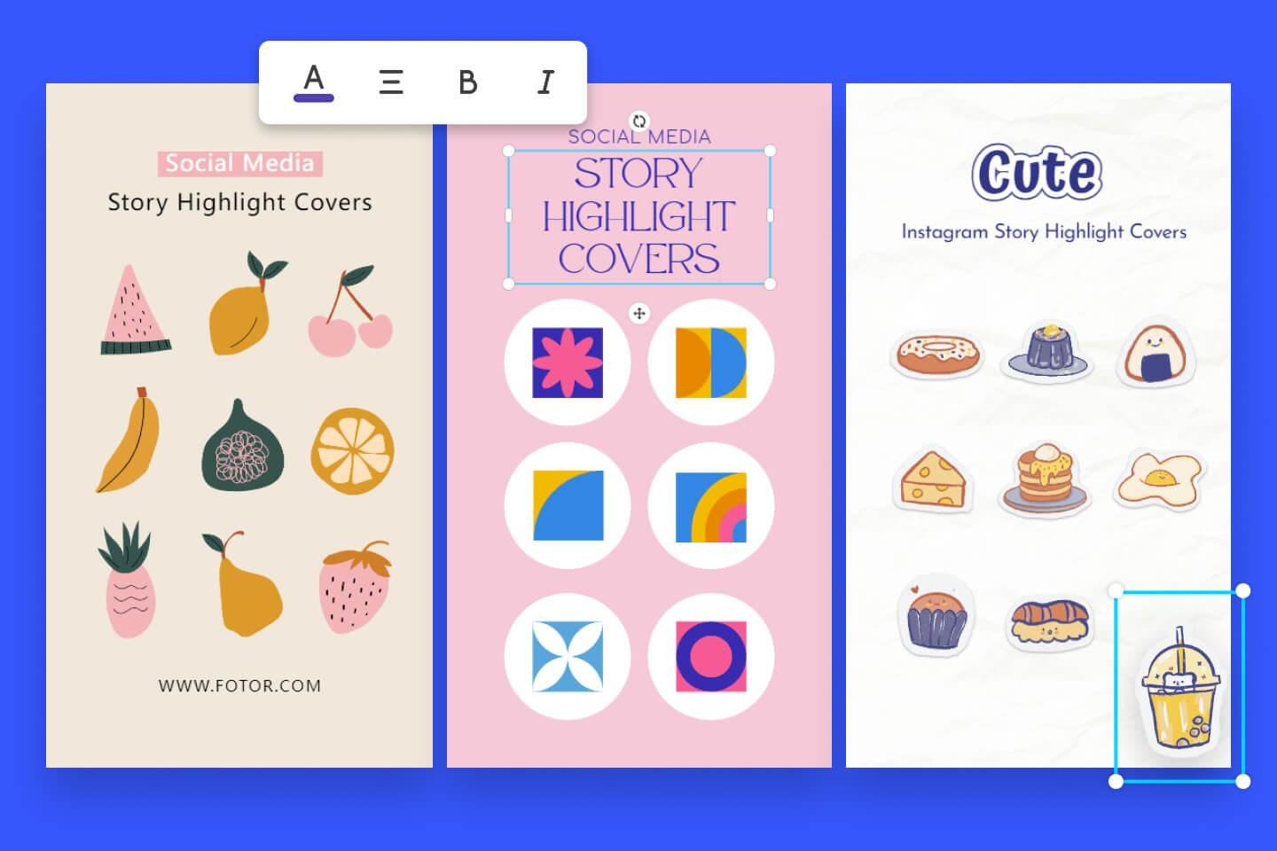
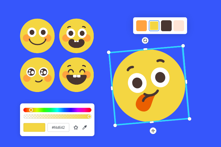
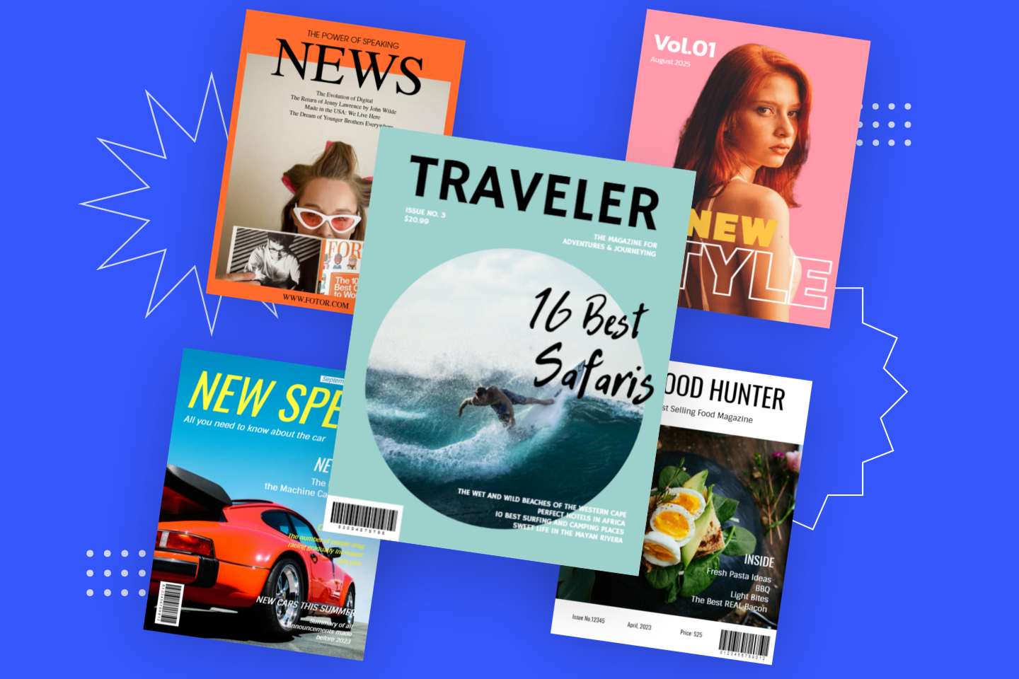
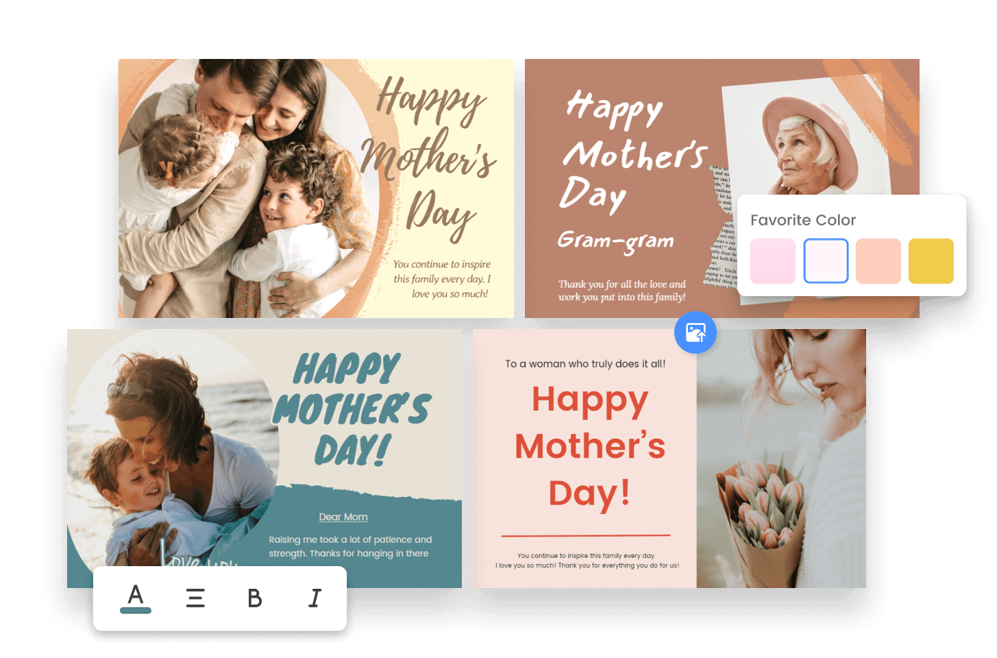
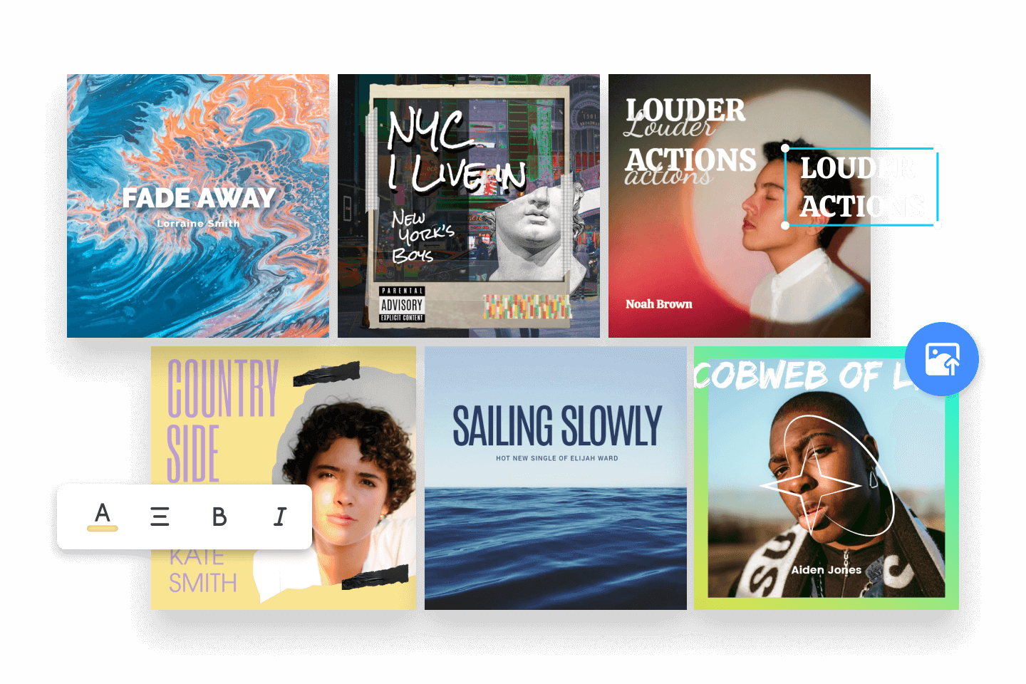
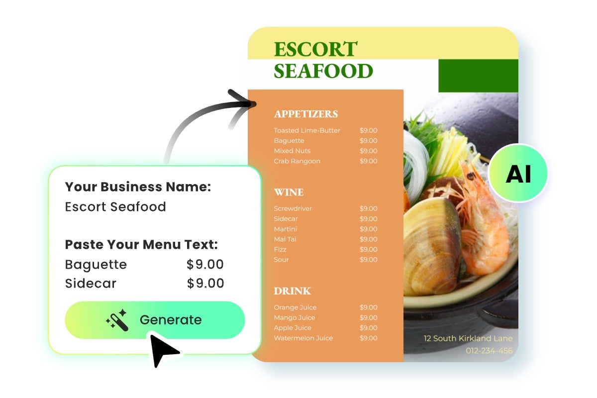
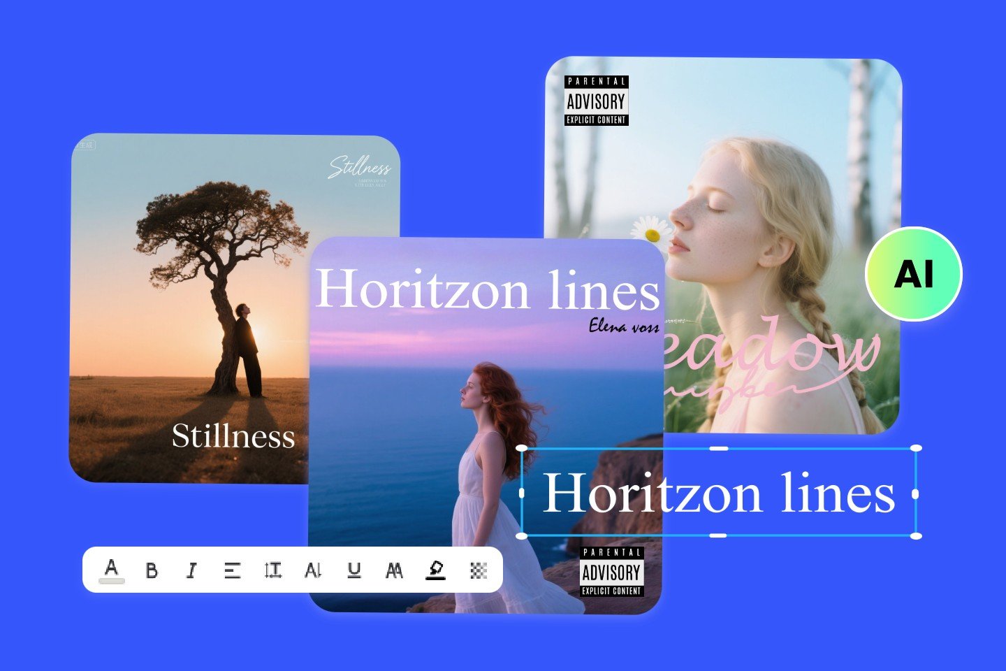
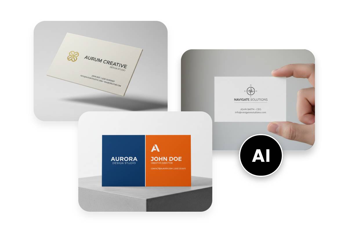
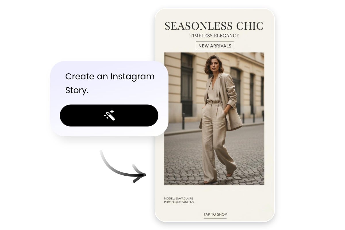
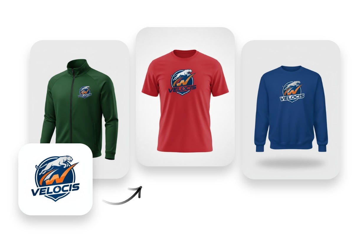
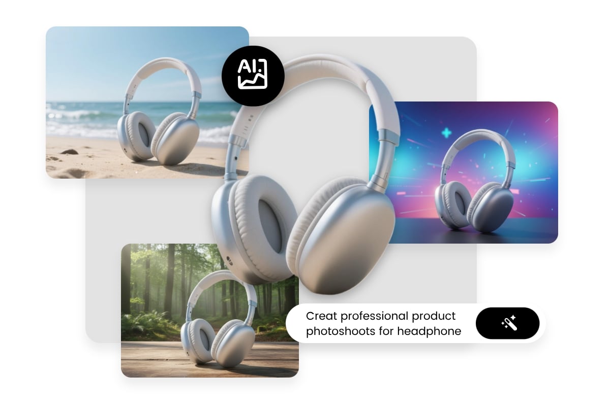
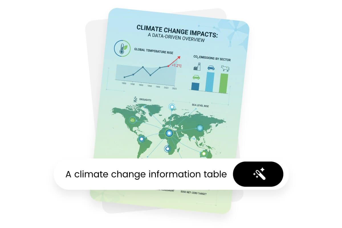
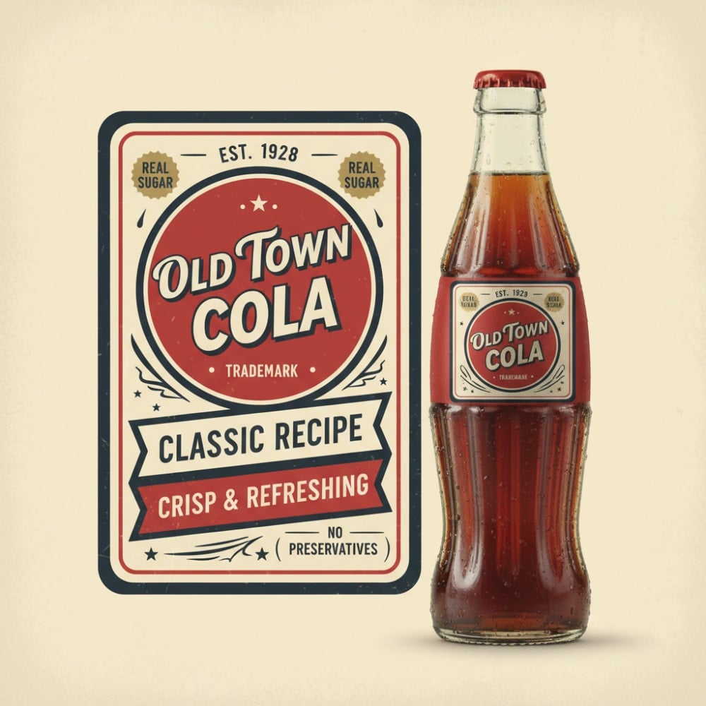
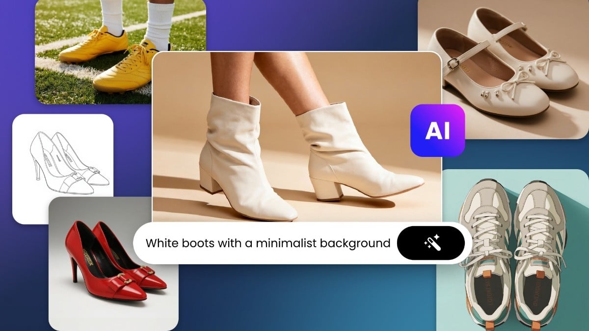
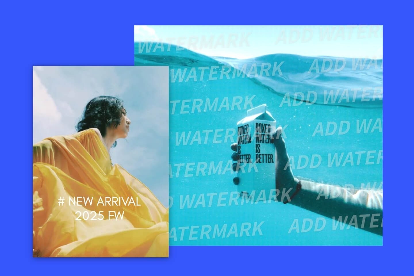
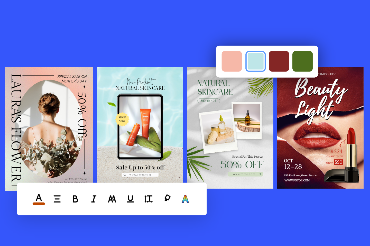
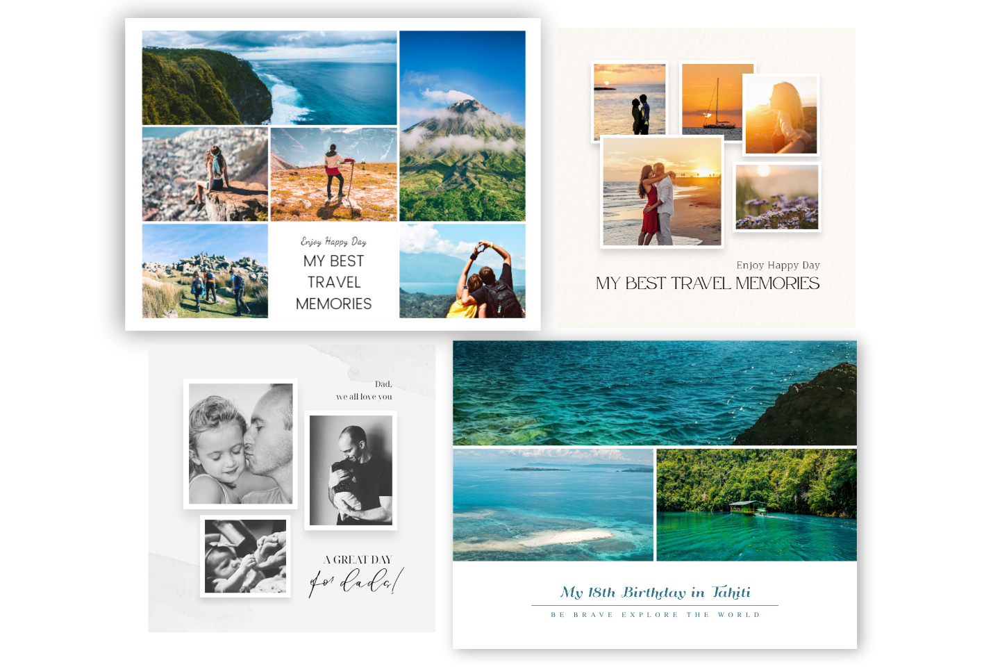
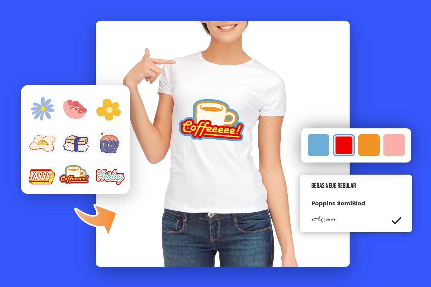
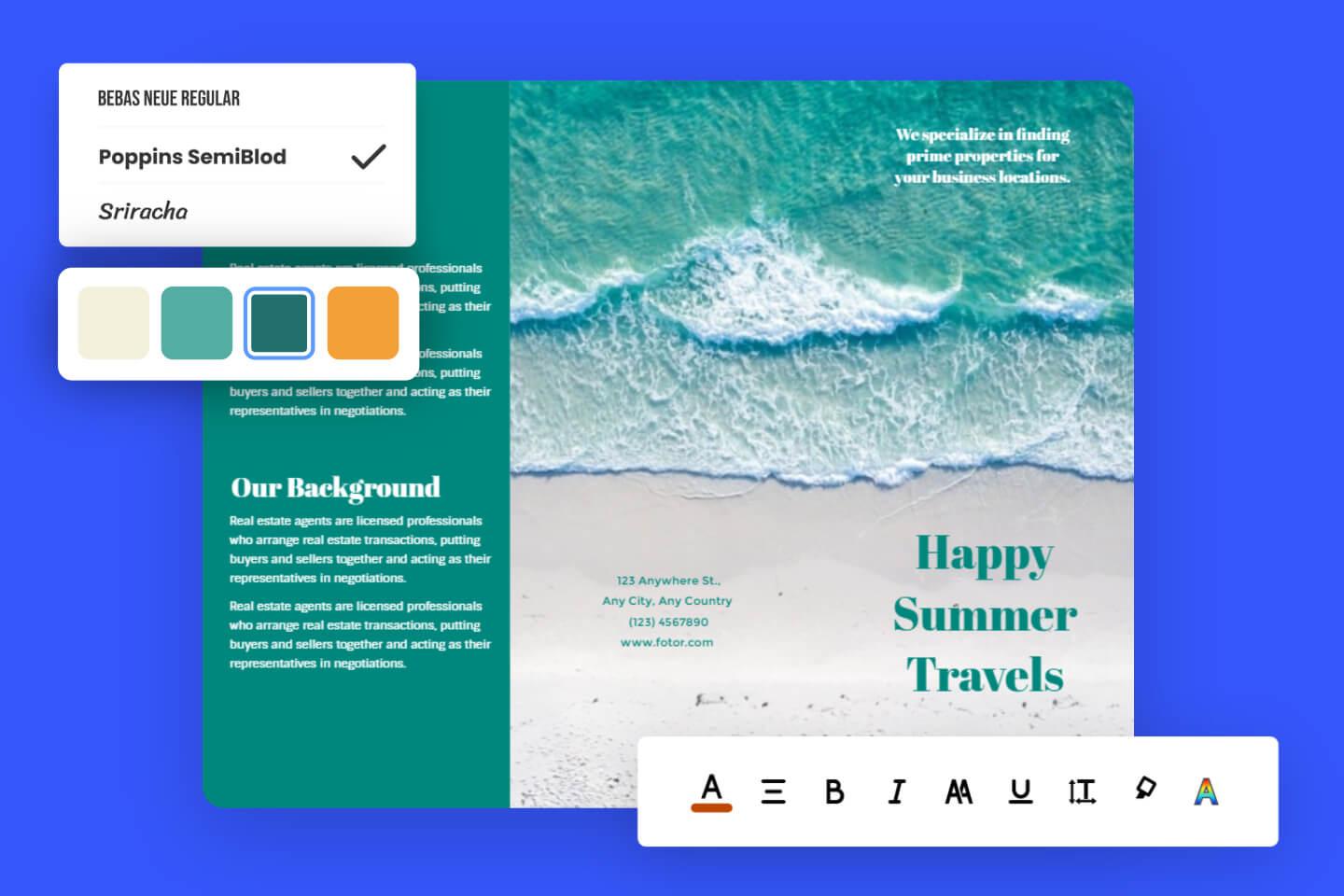
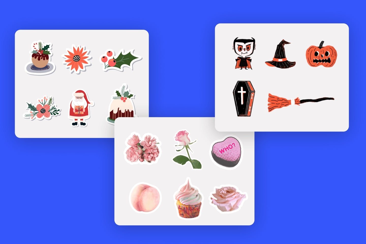
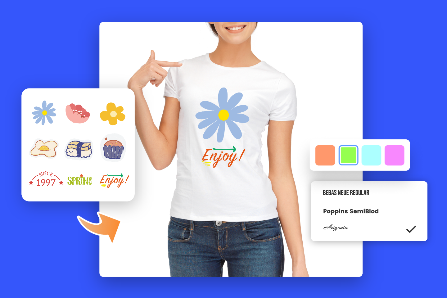
3 Simple Ways Help Designer Make Outstanding Graphics

3 Simple Ways Help Designer Make Outstanding Graphics

While shooting or editing, many designers will encounter the problem where the whole picture comes off too messy. Chaos will give people a messy, even distracted feeling, which can be exactly contrary to the purpose of design. In many cases, the purpose of a design is to convey information, and anything that is too messy will affect visual communication. What should you do to effectively avoid a messy picture?

1. Alignment Principle

Alignment is a very fundamental point of reference in design. In many cases, pictures are confusing because the elements are placed indiscriminately without any rules. So, the rational use of the alignment method is a good way to avoid a messy picture, and the alignment process is also the process of arranging elements. Such as:

alignment

Source: uisdc.com

success quote facebook post

The feeling on the left side is disorganized and unregulated. It is easy for users to feel taken aback, while the right side is uneven, but because of its alignment method, it does not appeal visually very much. The feeling of chaos, because no matter how, is aligned to the left, which organizes it quite well. Alignment techniques are fundamental and most commonly used in text layouts, poster and page designs, and more. In fact, the alignment can also play a positive tandem role, because the elements that exist visually according to certain rules the user will consider to be related.

2. A Series of Visual Elements

One of the most common reasons for a picture being too messy is because the elements do not echo. What that means is that each element is independent and do not correlate. It is impossible to form a complete visual idea in the user’s mind, and such a picture is relatively easy to see as nothing more than chaos. Then one of the commonly-used techniques to avoid the picture being too messy: Concatenating different visual elements and visually showing relevance, forming a visual chain that will not break. An example of concatenating visual forms:

Different pattern arrangement effect

Source: uisdc.com

Here, each color block is used as a different visual element or column in the picture. The left and right sides use the alignment principle, but from a visual perspective, the overall feeling on the left side is still chaotic.

The reason is that each visual element has no morphological relevance and is independent. The picture as a whole cannot form a very distinct visual chain in the user’s mind. The right side is reduced to a bunch of different visual forms, which makes the complete piece well united, and the arrangement is also a left-right and right-left form, which allows the user to form visual inertia in a short time. It is excellent at avoiding the appearance of the problem in the picture, but it does not mean that the elements must be placed 1:1 repeatedly, but to make each element related to each other, that means:

Add stickers before and after comparison

Source: uisdc.com

The left and right visual elements are in the same position, but the left side feels messy because there is no correlation between each visual element, while the right side maintains the same tonality overall. Using the feeling of metal, each individual visual element is placed in front of the audience, and a complete visual chain can be formed. Finally, by simply changing the shape, it is not entirely monotonous because it is too uniform, which is a style that changes its unification and finds visual connections throughout the change.

Visual elements in the series can also be connected through value, and the color echoes to form a good tandem effect, such as the common:

Different color arrangement effect

Source: uisdc.com

What is to be expressed here is to connect all of the colors as much as possible, rather than allowing them to be unrelated. The diversity of colors brings about visual inconsistencies, which is why you should achieve hues that do not expand past three colors and try to keep the saturation and brightness similar. The complete independence of any element may bring about visual clutter. Try to have a hidden law to constrain the visual elements, and finally form a visual chain between the individual elements.

For example, some web designs or official web design pieces greatly demand color. The purpose of echoing is to make elements relate to each other and form a visual series.

choice quote

This graphics gives people a feeling of being very comfortable and not messy. One of the reasons is the overall visual elements echo very well. Like the green plant, the visual form evokes a good tandem effect at each place. The picture’s tonality is basically the same, which can intuitively connect each visual element in a series. Each element is not placed indiscriminately, so the overall feeling is very comfortable and not messy.

Here is another example:

valentine’s day sale poster

In the active layout, the visual connection is taken into consideration, so the feeling is not chaotic, but the layout is very active.

Having said that, in fact, it is necessary to effectively connect independent visual elements, allow them to interact, and then effectively combine alignment principles. This is also a common method to effectively avoid picture disorder, and serializing visual elements is also regularization.

3. Steady Center of Gravity

In the design pieces, the steady center of gravity is the most common. If the center of gravity is off, it will cause people to develop a tendency to balance visually, giving people a feeling of instability. This is not an absolute factor in the disorder of the picture, because some designs deliberately change the center of gravity of a picture to seek visual differentiation, so under the premise of adhering to the first two points, we should consider the center of gravity. For example, the color echoes in the upper and lower cases in the previous case also played a very good role in the center of gravity. Many good posters like to adopt a smooth composition, such as:

coffee shop buy one get one free poster

No matter how many elements there are, the overall steady center of gravity makes the picture feel less cluttered because of a lack of visual proportion but gives a feeling of stability and coordination.

toy house big sale poster

Conclusion

When the picture feels chaotic, you can find the root of the problem by combining the overall review mentioned. Of course, these graphic design methods are a few common ones, not all of them. They should be used flexibly on these foundations to learn to summarize and expand but be limited to theory. Many design theories provide a direction for everyone. experience more understand more and use more.