


An infographic, a graphic visual representation format, now plays an important role in conveying information, data, and knowledge. There are types of infographics used for design, marketing, and education to present essential information in an engaging way. In this post, we’ll explore what is an infographic, the common infographic types, important elements, and how to make an infographic with an AI infographic generator. Let’s get started.
What are Infographics?
Although it has been a handy tool for delivering messages in the market for a long time, there is still a large group of people unfamiliar with the term infographic. So what is an infographic? Let’s begin with the word itself - the infographic originates from the words “information” and “graphic”.
As the name suggests, an infographic is a visual form that combines the story you tend to tell and visual elements, which can help people easily capture key points and enhance their comprehension of the information. With the infographic visual tool, everyone can understand and explain data, processes, comparisons, and even concepts engagingly.
How an Infographic Works?
An infographic makes it much easier to understand the presented information by converting the complex and dry text contents to a clear and visual form that people can understand at a glance. With the stylish visuals, eye-catching font, and organized hierarchy, it allows users to quickly get the information and data that it tends to convey. When one comes to an infographic, each component, such as icons, colors, and charts, can help them quickly grasp the main idea of it.
The performance of an infographic is influenced by the clarity level of the design, word expression, and how well the key elements work together. Colors can be used for highlighting main points, typographic hierarchy will catch people’s attention, while graphics present the relationship and comparison. Through concise words and clear visual cues, the infographics can reduce the cognitive barriers and complex ideas. That's the magic of the infographics!
What are the Purposes of an Infographic?
So what exactly are infographics designed for? Let’s break down their purposes:
Enlighten people: As explained by the well-known data visualization expert Alberto Cairo, the main purpose of an infographic is to enlighten people. People require such a visual form to better understand and learn the information through the simple and attractive graphics. The aim of infographics is not to encourage people to purchase products or services, but just to let them know the information with ease.
Convey messages clearly and quickly: The important content will be visually highlighted in the infographic, making it effective for people to deliver the key points they would like.
Simplify complex information: According to the reading habits of humans, visuals are more memorable than text. Unlike pure text content, infographics combine different kinds of graphics, images, charts, icons, etc., to display complex information and relationships, making it hassle-free to clarify and understand.
Improve engagement: The eye-catching infographic can improve people’s engagement, making them pay more attention to the interesting graphics, images, icons, and other elements shown in the infographic poster.
Most Common Infographics Examples
Infographics can turn complicated information into a visual you can actually understand in a short time. But what does an infographic look like? You’ll find examples of different styles out there, each better suited for certain tasks or messages online. So let’s dive in. Here are the 8 most popular types of infographics you’ll come across.
1. Data Visualisation Infographics
A data visualization infographic transforms numerical or statistical information into easy-to-follow visuals, so viewers can spot patterns, trends, and comparisons in a flash. It combines elements like bar graphs and line charts all in one place, giving you a clear snapshot of the information.

Click here to create a data visualisation infographic with prompts
Suitable for: Business reports, academic research, financial analysis, and marketing campaigns.
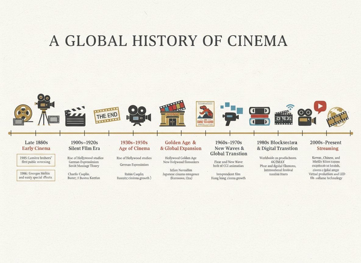
2. Timeline Infographics
Timeline infographics lay out events and processes in order, so everyone can see what and when they happened. Usually, they're set up horizontally or vertically, making trends and changes over time obvious.
Click here to create a timeline infographic with prompts
Suitable for: Historical overviews, project plans, product development cycles, and event summaries.
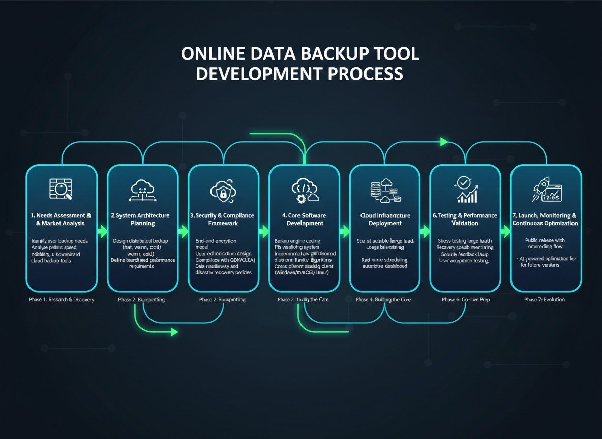
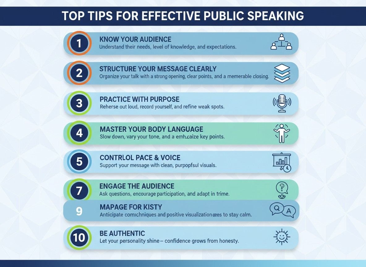
3. Process Infographics
If you try to present a step-by-step procedure, process infographics can be a wonderful choice. They lay out each step in a way that’s easy to follow, even if the process itself feels complicated. With everything visible and clear, people can pick up and remember the idea faster.
Click here to create a process infographic with prompts
Suitable for: Educational materials, business presentations, training guides, and marketing campaigns.
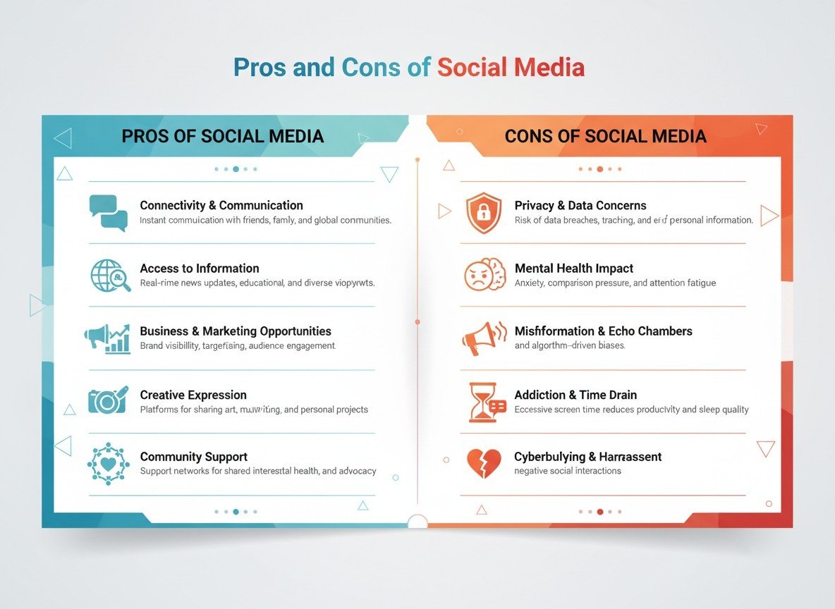
4. Comparison Infographics
The next common infographic is comparison Infographics. They’re great when you want people to weigh their options in a snap. These infographics lay out the key differences and similarities side by side with bar charts, bold colors, and simple icons, making it quite clear what sets things apart and where they overlap.
Click here to create a comparison infographic with prompts
Suitable for: Product comparisons, service evaluations, market analysis.
5. List Infographics
List infographics organize the content into a clear and easy-to-read format with elements such as bullet points, simple icons, and numbered sections. This approach breaks things down, so people will be able to pick up the main points instantly.
Click here to create a list infographic with prompts
Suitable for: How-to guides, product features, and content summaries.
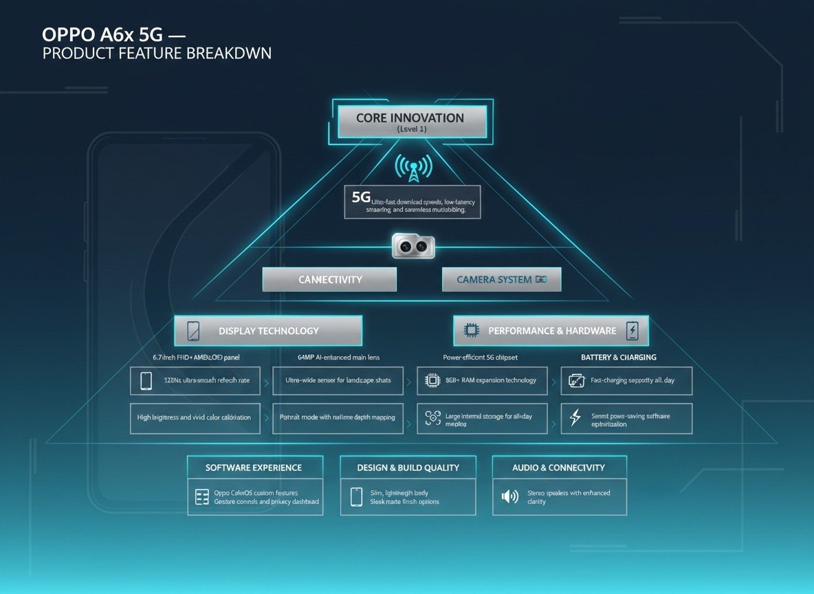
6. Hierarchy Infographics
As a visually powerful way to organize information, Hierarchy infographics really know how to catch people's eye and make sense of complicated info. By sizing things up, playing with colors and layouts, It provides a clever way to show what matters most, so even dense data suddenly feels clear and easy to follow. Viewers can spot the key points right away, with no browsing around required.
Click here to create a hierarchy infographic with prompts
Suitable for: Project timelines, business presentations, product feature breakdowns.
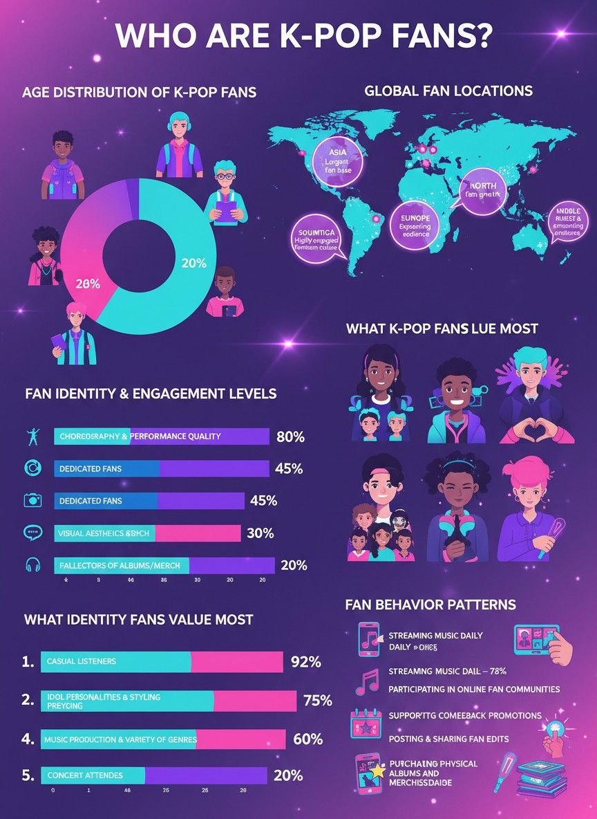
7. Statistical Infographics
Statistical infographics transform complex numbers into eye-catching visuals that actually grab people’s attention. Whether it’s a comparison of data points, a trend over time, or a breakdown of key figures, statistical infographics make it easier to absorb and retain information.
Click here to create a statistical infographic with prompts
Suitable for: Market analysis, annual reports, research data, and financial overviews.
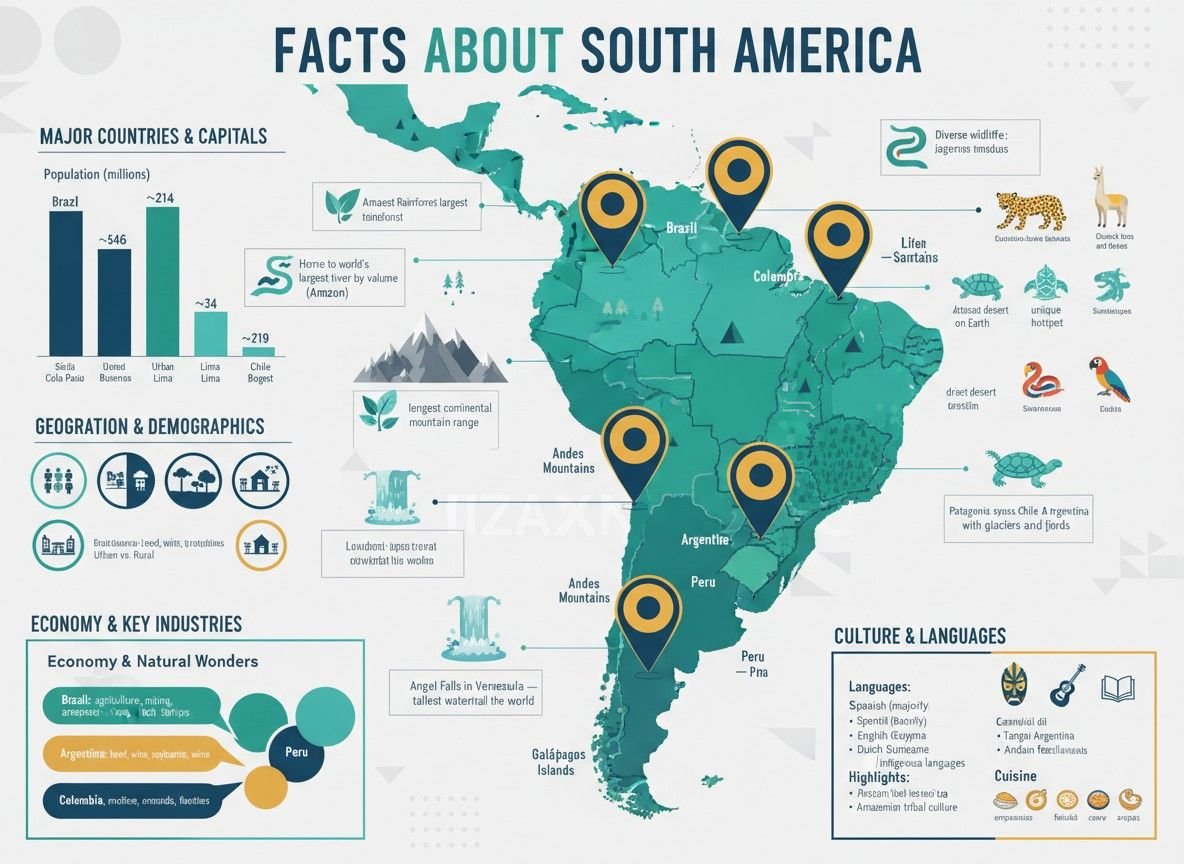
8. Location-Based Infographics
Location-based infographics are really useful when you need to show how data ties to a specific place. By incorporating maps, location pins, and color-coded regions, these infographics make complex data tied to specific places both engaging and intuitive. The combination of location and data makes them ideal for storytelling, allowing people to connect the numbers to real-world geography with ease.
Click here to create a location-based infographic with prompts
Suitable for: Marketing campaigns, sales territories, travel blogs, regional statistics, and demographic analysis.
What Makes a High-Performing Infographic?
What is included in an infographic? I’m sure that most of us have been frustrated by the key elements of a good infographic. Understanding the elements is an essential step to making an infographic.
1. Accurate data: Without reliable and well-researched data or information, the infographic may lose its credibility among the readers. So you need to get data from reputable sources such as industry reports, surveys, and government databases.
2. Organized layout: An organized layout is essential to making an infographic both visually appealing and easy to understand. Please arrange your content clearly and logically, making the structure with a clear hierarchy, so that viewers can comprehend the infographic effortlessly.
3. Eye-catching images and icons: The high-quality and attractive visuals can enhance the message of your infographic. You can choose visual materials that are directly related to the theme of your infographic, whether they’re charts, graphs, or icons. Please focus on a few that convey your key points clearly, instead of overloading similar images.
4. Concise and readable content: Since infographics are designed to convey information quickly, it’s important to keep text short and to the point. Please focus on the key takeaways without lengthy paragraphs, making the words more understandable. Font also plays an important role in readability, so you should select clean and legible fonts, and ensure the text size is appropriate for different devices.
5. Consistent design style: A consistent design style is crucial for creating a professional-looking infographic by enhancing the messages and strengthening the visual appeal. To make the infographic work well, please stick to a limited color palette that reflects the theme of your content. Also, maintaining a balance between text and visuals can be helpful for avoiding overcrowded design.
How to Make an Infographic?
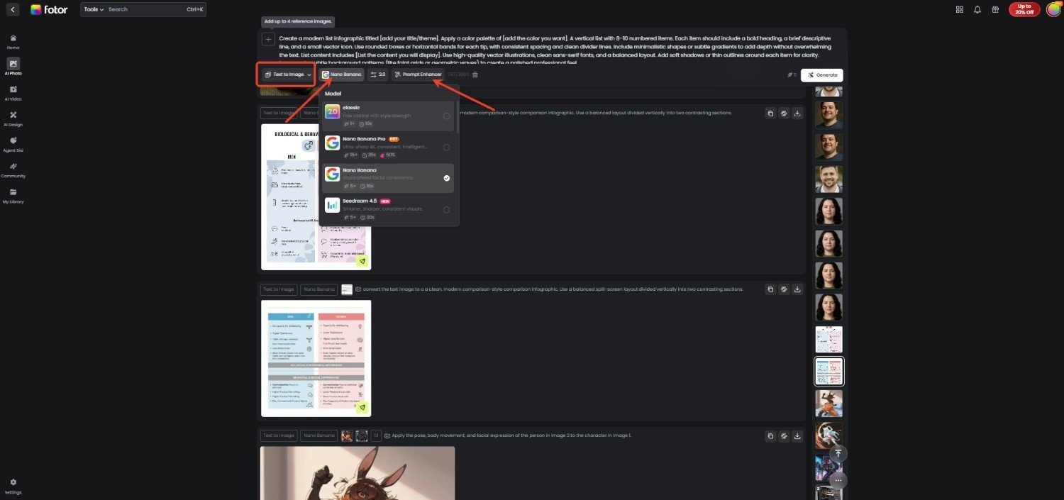
Creating an infographic can be somewhat tricky, especially for those who are not a visual design expert. To easily turn the complicated and dull information into an intuitive infographic, you can try the Fotor AI infographic generator.
Combined with multiple AI models, such as the trendy Nano Banana Pro, Seedream 4.0, and Kling, it enables users to produce an HD AI infographic image with a reasonable layout, clear and accurate text rendering, stylish visuals, and consistent style from image or text prompts. Let’s create an infographic with ease.
1. Go to the Fotor website and turn to the AI image generator.
2. Add the text prompts about the infographic you want to generate.
3. Then you can choose Nano Banana Pro and other AI models. Followed by customizing the detail settings, including aspect ratios, resolution, image number, and visibility.
4. If you want to better organize the added prompts for a wonderful infographic image result, click “Prompt Enhancer” for help.
5. Once done, click on “Generate” to create an infographic poster image and download it to your device.
Final Thought
What is an infographic, and what is the point of an infographic? Infographics can not only simplify complex information but also convey it much faster in an engaging way. Knowing its definition, purposes, common types, key elements, and how to create one with an AI infographic generator are helpful when you're eager to manage the dull information and design a visually appealing infographic from it. Look no further, learn the details of the visual presentation method, and try to create an infographic with just one tap.