Font Style Guide: How to Choose the Right Font to Boost Your Brand

Choosing the right fonts and combining them is like matching an outfit. You need different clothes for different events and occasions. Typography makes a first impression that influences the rest of the design. With the help of a font, you can affect how the user feels, make them click on certain things, or focus on something.
In this article, you’ll get to know what types of fonts exist, how to select fonts for particular designs, how to combine them right, and which ones are trending in 2019. As a bonus, we added a few websites where you can find and download free fonts for your projects.
Font Styles
The world of typography is huge and overwhelming. People who’ve ever dabbled in typography may say that there are too many types of fonts categorized by a milieu of different factors. But let’s not overwhelm ourselves with these subjective aspects, and rather focus on basic font types that will be good to know in terms of design.
Fundamentally, there are five types of fonts: serif, sans-serif, slab-serif, script, and handwritten. Let’s get a closer look at each of them.
- Anatomy of a Type
Before we dive deeper into the world of font styles, you need to know a little bit more about the anatomy of a type. All letters of a font are placed on a baseline. It is an imaginary line that keeps them all level.
A mean line is an invisible center. Some letters like Y and P are lying on the descender line that goes below the mean line. Letters T and H cross the ascender line that goes above the mean line. A picture is worth a thousand words, as they say, so see for yourself in the illustration below on exactly how each part of a letter is classified:
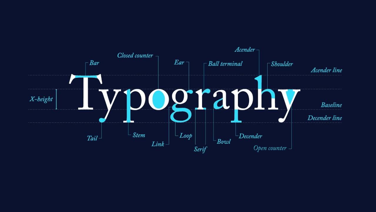
Every letter has its own basic sections, but its weight, height, and shape are defined by what family or type the font falls into.
- Serif Fonts
Serif fonts are classic. They have little feet attached to the bottom or top of the letterforms. Serif fonts are considered traditional and ‘serious.’ These types of fonts were created by the Romans who wrote letters with brushstrokes back in the 15th century.

Click the Photo to Edit
There are hundreds of smaller classifications for serif fonts, but all you need to know about serif fonts is that they appear in every book and newspaper you read. The most popular example of a serif font is the near-ubiquitous Times New Roman font.
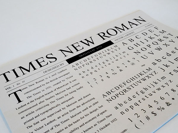
Serif fonts are the perfect choice for logos, printed copy, and body text. They are the most trusted type of font in the world.
- Sans-serif
‘Sans-serif’ literally means without ‘serif.’ These fonts are minimalistic, simple, and they don’t have extra parts at the end of the strokes. Sans-serif fonts look more modern and are suitable for a wide range of designs. They gained popularity in the nineteenth-twentieth centuries, which is why they are often called the fonts of the modern era. The most popular sans-serif fonts are Futura and Helvetica, created by German designers in the mid-twentieth century.

Click the Photo to Edit
Since serifs are usually small, most designers don’t like how serif fonts are displayed on screens. They may be seen as noisy and of low-quality. This is the reason why crisp, sharp sans-serif fonts are widely used on the web, especially for small logos.
Click the Photo to Edit
Thanks to its minimalist straightforward style, they can be easily combined with other font styles, such as slab serifs and script fonts.
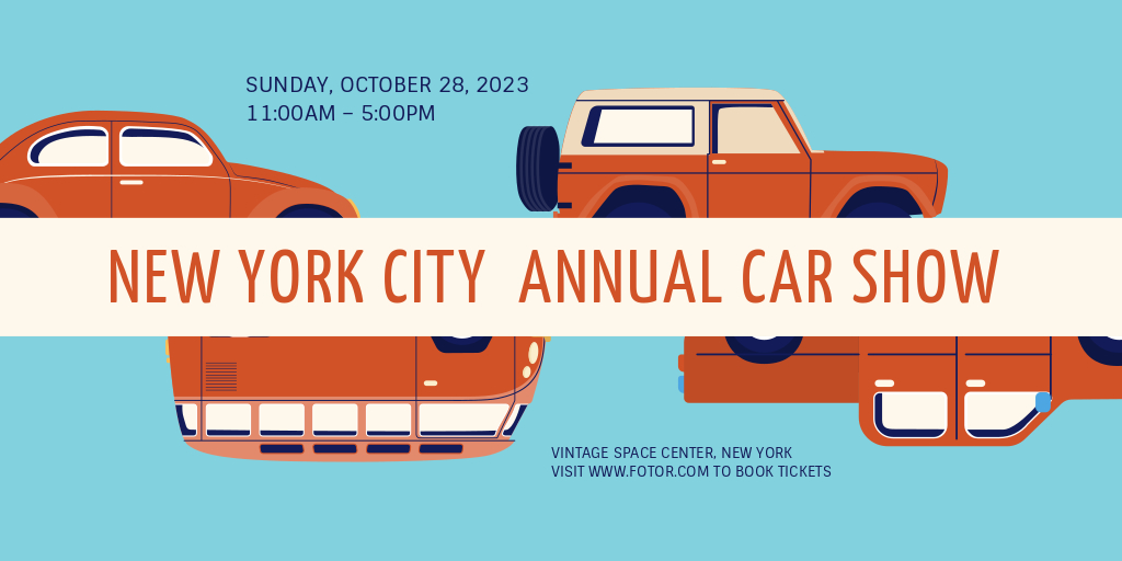
- Slab-serif
Slab-serif fonts are actually serif fonts, but with large, impressive, bold ‘feet.’ They are created for posters, billboards, and advertising that are designed to be seen from a long distance. Using slab serif fonts in your design will add a little vintage retro vibe to it.
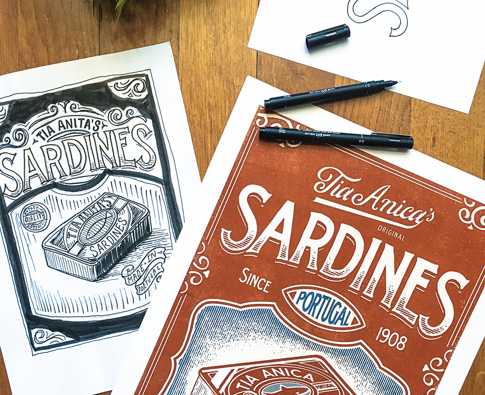
behance.com/Vintage sardines packaging
This is a great solution for any outdoor designs, such as a billboard or a sign. Slab serif fonts can be also used for titles and headlines.
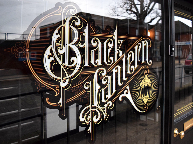
dribbble.com/Window Sign
- Script
Script fonts are those you may have learned in school and were called cursive. This type of font mimics handwriting. Usually, they have connecting letters. Script fonts can be used in numerous graphic designs can be elegant, casual, as well as add a personal touch to any project.
As a rule, script fonts are separated into two categories: formal and casual. You can recognize formal fonts with ease by their big curls called swashes. Don’t use them too much, and only if you are not rewriting 18th-century memoirs. Such fonts may seem old and even out-of-style, but they are suitable for wedding invitations, book covers, and other designs steeped in tradition.
Click the Photo to Edit
Casual style script fonts were developed in the 20th century and have less smashes and curves. They seem modern and simple, which makes them an ideal choice for any design, such as logos, business cards, posters, postcards, banners, website headers, and more.
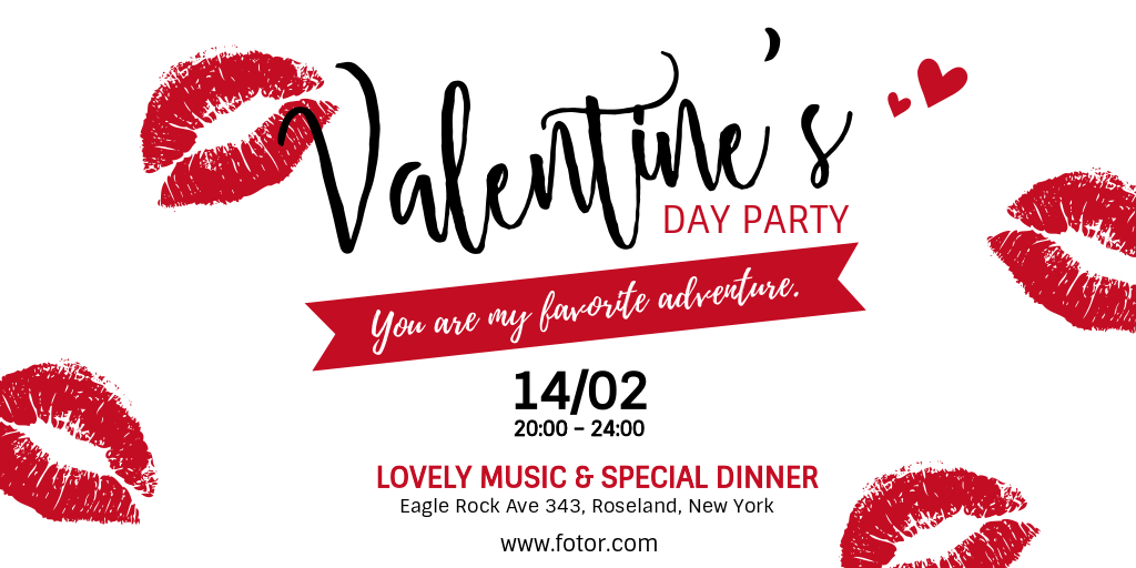
Click the Photo to Edit
- Handwritten
Handwritten fonts are only a recent addition within the last decade. This type often lacks structure, but they mimic natural handwriting flow and swashes.

Click the Photo to Edit
Handwritten fonts work quite well for postcards and business cards, logos, branding, and any other designs that need a unique and personal feel. Notice that some handwritten fonts do not have enough punctuation or symbols. They can be a perfect option for headlines but are not readable or useful for other purposes.
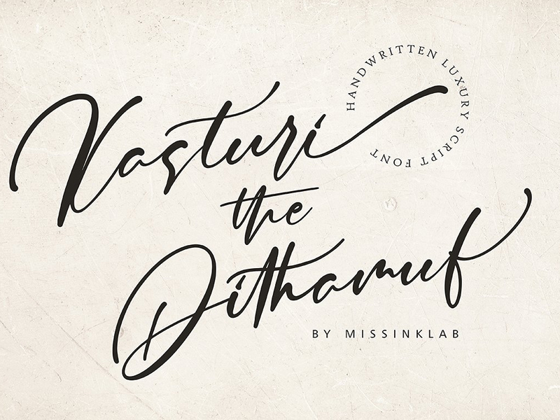
dribbble.com/Kasturi Dhitamuf Luxury Script Font
How to Choose A Font
Every type of font has its own personality and mood. It can be serious, casual, playful, elegant, or minimalistic. This is why, before combining fonts, you need to think about what message your design is going to convey.
- Readability
It’s important that the font doesn’t distract a reader from the message you share. Your audience should be able to easily read the words written on your design the first time. You need to choose a readable font style at the outset, especially if the text is small.
There are a few ways you can increase your font’s readability:
– Use size. Obviously the bigger the text, the better it can be seen and read. However, sometimes you need to use small text for a banner. Then you can increase readability by using a horizontal scale.
– Use space. The distance between letters also matters. Play around with font spacing if you need to place text in a small box, but still need to keep it visible.
– Use height. This is another parameter you can manage to keep the text readable in limited space.
- Remember Context
How, where, and by whom your design is going to be viewed should influence your type choices. Think of what emotions you want people to feel when looking at the text and what your call-to-action is. With millions of fonts available online these days, you may easily get distracted by creative and decorative fonts that look interesting, but do not fit the project.
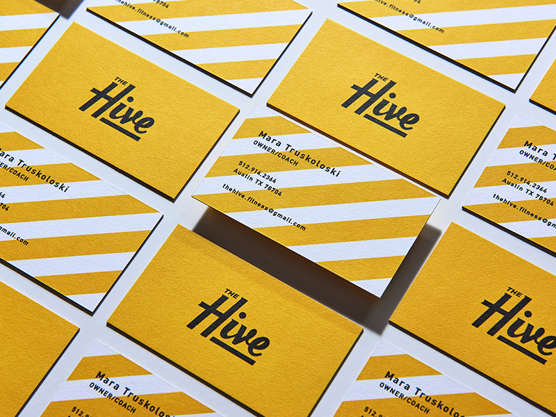
dribbble.com/The Hive business card for a coach
A mistake most beginners make is not understanding which font is suitable for body text and which is better for headlines. When you design a business card with a purpose, obviously hand lettering, decorative fonts may make a wrong impression about the professional.
Or, when you design a postcard or invitation, it’s better to take into account handwritten and script fonts and pair them with simple serif or sans serif fonts.
- Combine Serif and Sans-serif Fonts
Serif and sans-serif fonts are two sides to a design coin, but you need to create compelling contrast using font sizes. This is a great trick for designers who need to find a quick font pairing.
Click the Photo to Edit
Serif fonts are more suitable for a large amount of text since they are smooth and easy to scan. Of course, make sure to take into account the characteristics of a certain type. Sans-serif fonts are more suitable for screens and online designs.
You need to take different fonts, combine them, and see how they go together.
- Use a Limited Number of Fonts
Using too many different fonts on the same page could clutter your design . Some magazines even have a rule to not use more than two to three fonts in the same layout.
dribbble.com/Fameily
Feel free to break this rule if you are trying to mimic an old design with lots of styles, or if your project requires a lot of fonts.
Though, any other type of project will only work with fewer fonts. Give every type a certain role, for instance, a font for the headlines, body text, and subheadings, and then cut any extra fonts from your design.
- Avoid Pairing Similar Fonts
Don’t use fonts that are too similar to each other. When you combine different fonts, they should make a contrast. It can be achieved with font size or visual difference. Fonts with similar weight, height, and shapes may look the same and be confusing. Check out an example of comparable fonts below.

In this design, similar fonts are combined, and a viewer sees no difference between them.

The same design, but with different fonts. Made with Fotor.
Every time you have two fonts to combine, place them side by side and see if they are too similar.
- Use One Font Family
When you run out of time and need to come up with a font pair quickly, another perfect solution is to use fonts from the same family. These fonts were created to play together. But remember to create a contrast with size, weight, slope, or case.
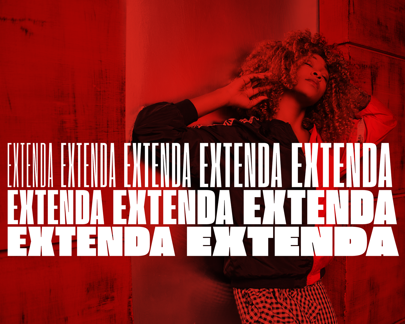
dafont.com/Extenda font
You can combine lowercase and uppercase text, or use bold and italic weights. Using fonts from one family will make your design more straightforward and will save you a lot of time.
Two Approaches in Font Combinations
In this font style guide content, I love to share two main combinations in art and design that can be applied to typography as well. They are harmonic and contrasting combinations.
You get a harmonic combination when you put fonts from the same family or the same era together. For example, Futura and Baskerville fonts work amazingly together. Baskerville is a perfect serif font for body text and Futura in all caps could be a great solution for a headline. As I mentioned above, combining sans-serif and serif fonts is always a ‘safe bet.’
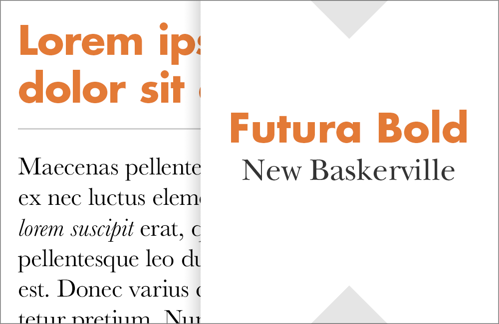
bonfx.com/Fonts that go with Futura
Click the Photo to Edit
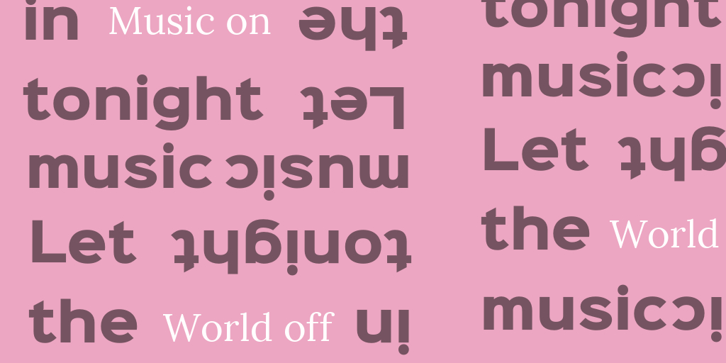
In order to get a contrasting combination, you need to pair completely different fonts, for example, sans-serif and script or handwritten fonts.

Click the Photo to Edit
This Twitter post used the Playlist script font and the HammersmithOne sans-serif font for the headline. Siltony, a similar sans-serif font, is used for the body text. These fonts are totally different and that’s why a clear contrast is created. A post should drive attention, so bold script font and a big headline are suitable here.
Try to combine fonts yourself. Choose an anchor font that you are going to use for the body text, and then, depending on your design’s goals and context, chose the second font for a title.
Free Fonts to Use
If you can’t wait to play around with fonts and try new type combinations, you will definitely need some new fonts. There are millions of free fonts on the web which will keep your wallet nice and tight. Here are five websites where you can download new font types right now.
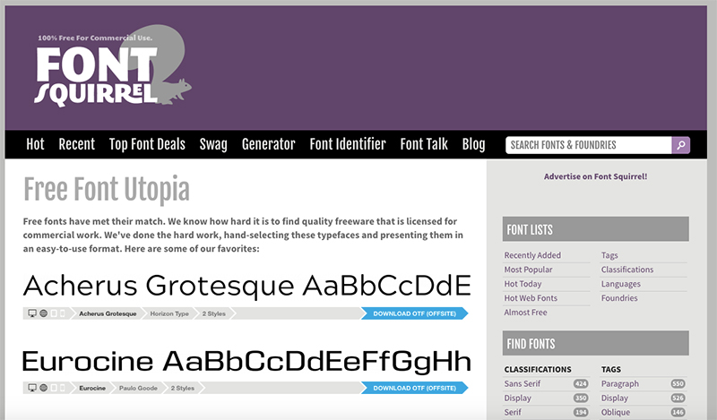
- Fontsquirrel
Fontsquirrel is one of the most popular websites to download free fonts. All fonts on this website are free, but also have commercial license. You can search fonts by tags, such as retro, slab serif, display, or use languages or lists.
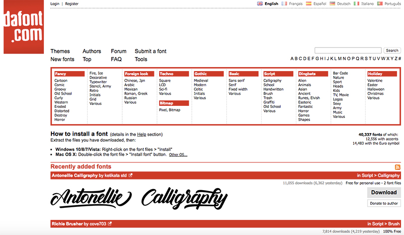
- dafont
Dafont is another great site with over 40k free fonts. Find fonts in different categories and styles, for example, modern, stencil, comic, brush, and many others.
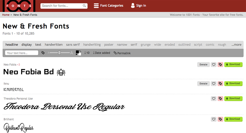
- 100fonts
100fonts is one more website with lots of free fonts, but here you should pay attention to the license. On 1001fonts, you can also use categories to browse different types. Use the text box on the top to write your text and see how it looks in different fonts.
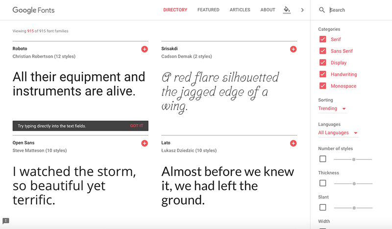
- Google Fonts
Google Fonts is a directory with many fonts for web use: websites, apps, and other online purposes. Obviously, all these fonts are optimized for the web and responsive. The best part about this resource is that you can preview every font in different sizes and styles before using it.
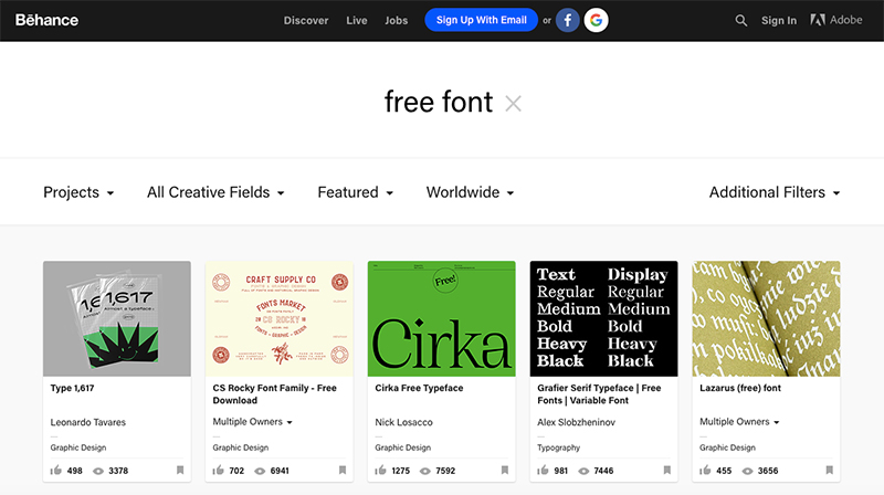
- Behance
Originally, Behance was not a source for free fonts, but for designers to shared their latest works. However, many creatives from all over the world share their fonts for free, along with images that show these fonts in action.
Over to You
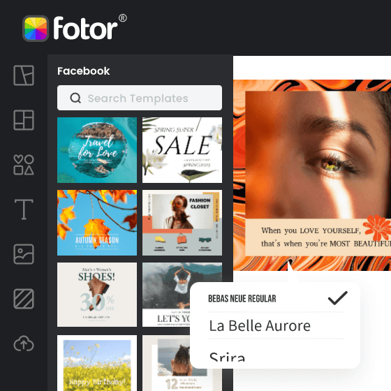
Learning to combine fonts is not an easy job, but just like with anything in life, you must practice in order to master it. I hope this article will become a perfect starting point for beginners who are just starting out their designer or typographer path. Fotor is the best tool to learn how to combine fonts! Check out our numerous templates and see what creative font combinations other designers use.
What is your favorite font currently and why? Let’s talk! Share your thoughts in the comments below.

Powerful AI-driven editing tools like AI background remover, AI enlarger, object remover, one-tab skin retouch, AI image generator, etc.
Help you easily enhance photos from any aspect.