Change Color of Image Online Free
Transform the hue of any object or background in seconds with Fotor’s precision AI. From rebranding logos to creating e-commerce product variants, our tool changes color of image while preserving natural lighting and intricate textures—no professional skills required.
Drag and drop your image here
Drag and drop your image here


3 Secs
Recolor
Zero
Texture Loss
99.8%
Accuracy Rating
Simple Edits, Professional Results
![Fotor AI precision icon]()
AI Precision
Smartly detects and isolates objects—like clothes, cars, or products—for clean, one-click coloring.
![Natural textures icon]()
Natural Textures
Replace hues while preserving the original highlights, shadows, and intricate textures for natural results.
![Custom icon]()
Custom Hex Codes
Input specific Hex codes to match your exact brand identity or product specifications perfectly.
![Data security guaranteed]()
Privacy Guaranteed
Your uploaded photos and signatures are processed securely and deleted automatically within 24 hours.

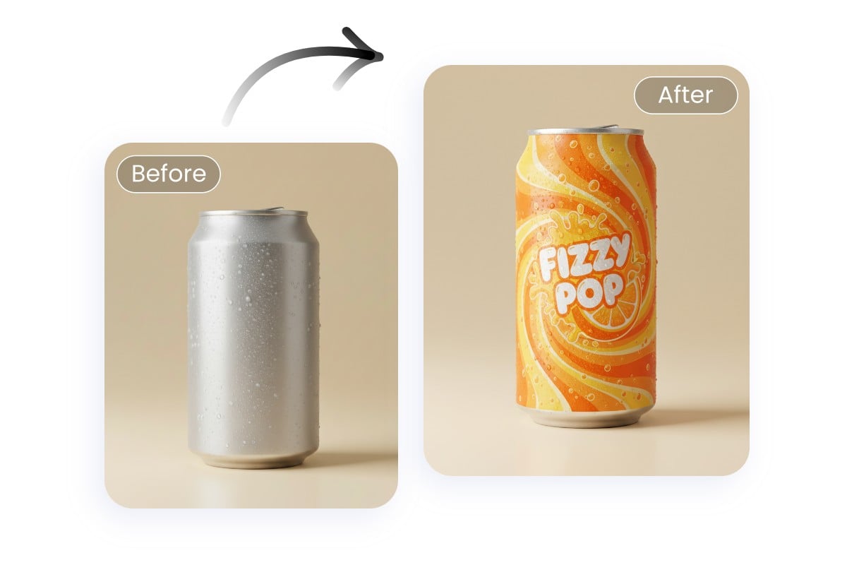
Change Color of Image in a Snap
Instantly change color of image online with our free AI color changer. Upload your photo to adjust color ranges, change logo color, or replace any shade in pictures. Click below to start your color swap.
Precisely Select and Recolor Objects
Powered by AI photo editing technology, our image color changer allows you to replace colors exactly where you want. Simply upload your image and select the target area for accurate edits and natural results in just a few clicks.
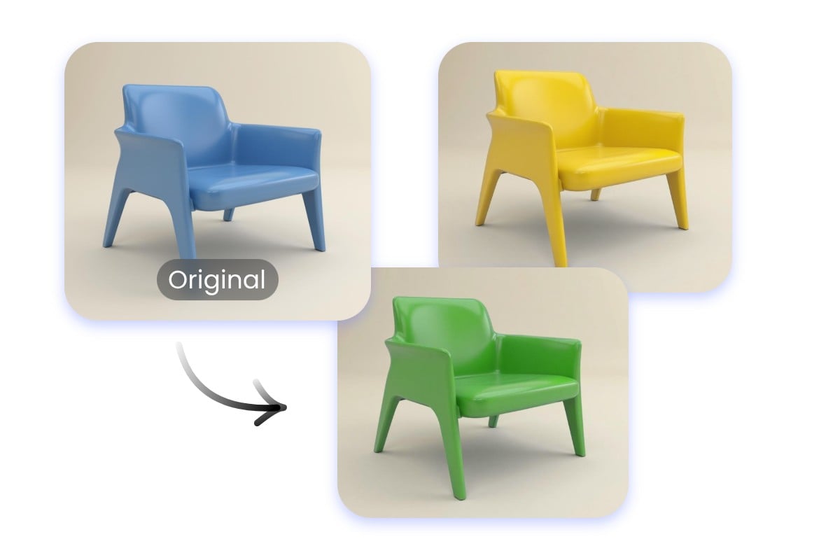
Multiple Colors for the Same Object
Preview and test different shades on a single object effortlessly, ideal for branding and product photos. From logo color change to creative edits, this photo color replacer makes experimenting with multiple color options simple and fast.
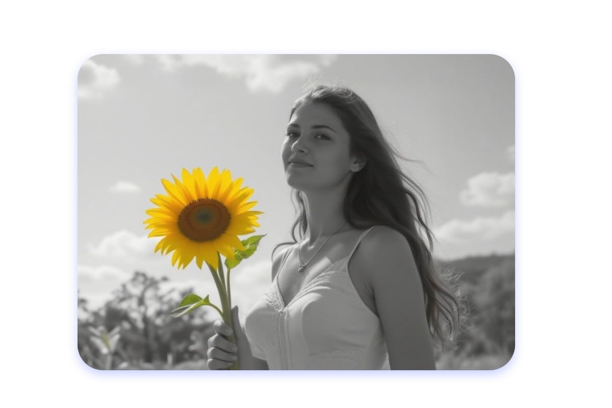
Add Color to Black and White Photos
Add color to black-and-white images with our photo color change tool. Our image color editor automatically detects objects, allowing you to replace the color in the image online for free. You can restore vintage photos or apply professional color effects for free.
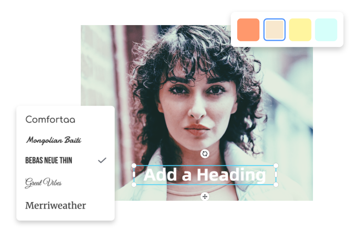
Colorize Your Image with All-in-One Customization
Go beyond colorization with Fotor’s full creative suite. After you change color of image, polish your visuals by adding stickers, text, and pro filters—all in one place.
How to Change the Color of the Image?

1. Upload Your Image
Upload the image you want to recolor into our AI color changer tool.

2. Adjust and Change Image Color
Select or input a prompt to change the specific object or area, and choose or input your new target color from the palette.
3. Preview and Download
Click "Generate" to see the instant color change. Once satisfied, download your high-res image or share it directly to social media.
Change the Color of Image with Fotor Color Replacer
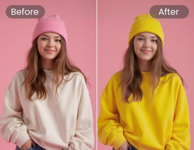
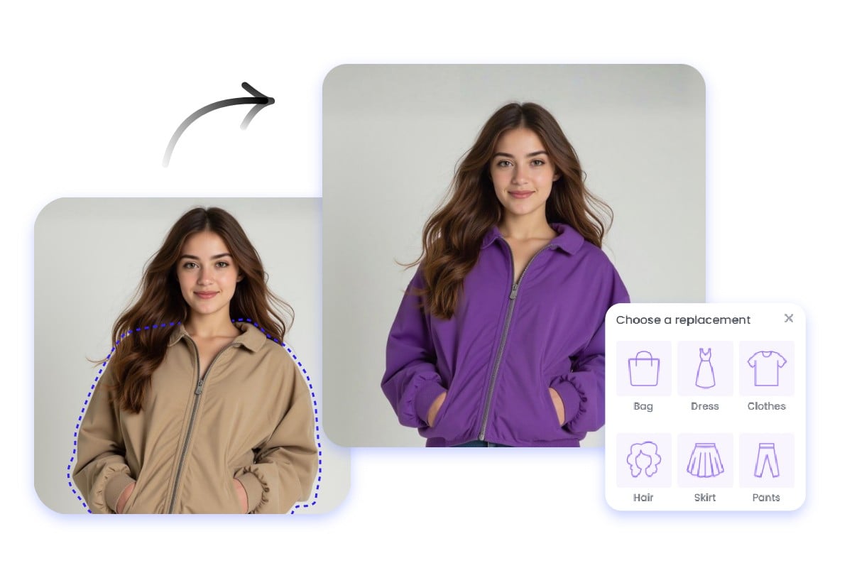
Change Clothing Colors
Experiment with different fashion styles and colorways in seconds.
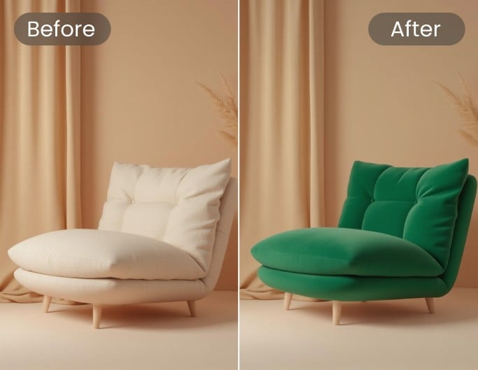
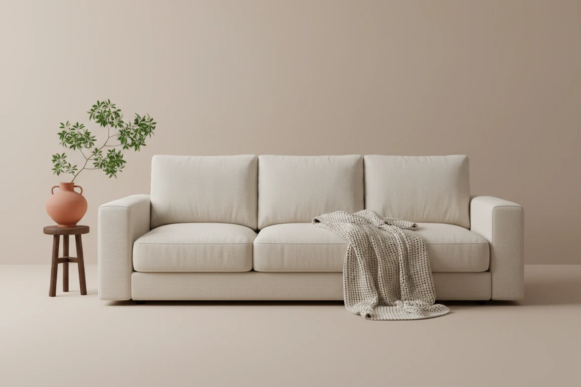
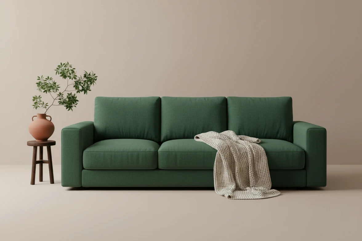
Recolor Furniture and Home Décor
Experiment with different shades to visualize new home decor and furniture palettes instantly.
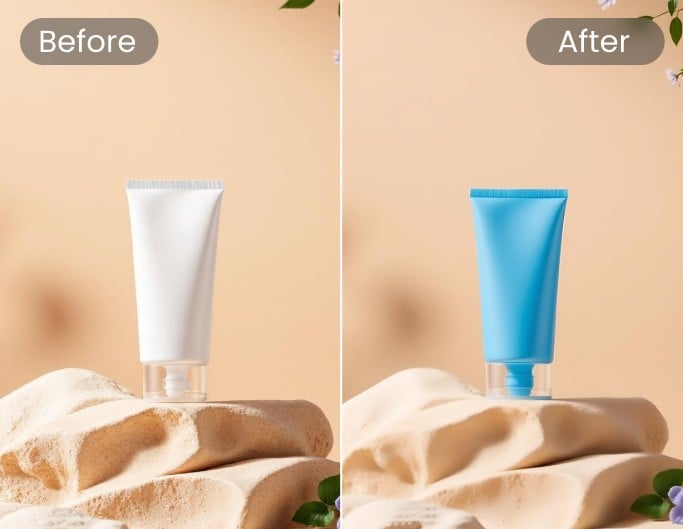
Recolor Product and Packaging
Rapidly create packaging or product variants for your store.

Change Car Colors
Visualize new shades or matte textures instantly before committing to a real-world paint job.
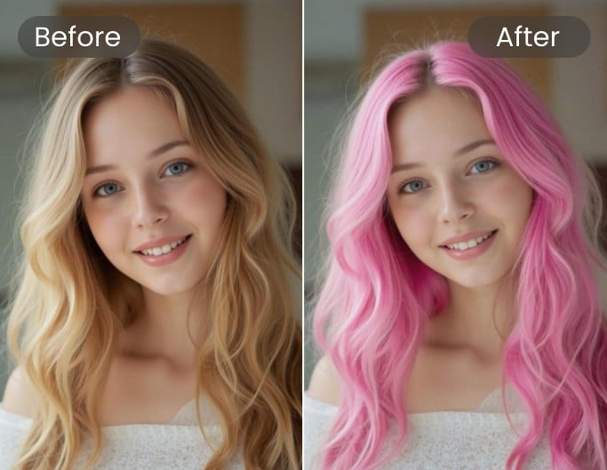
Try Out New Hair Colors
Try bold new hair colors for free and find your perfect look without any risk or commitment.
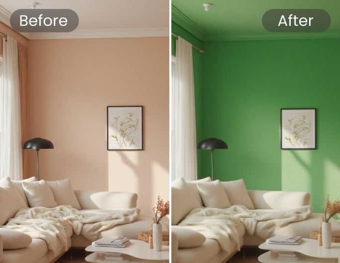
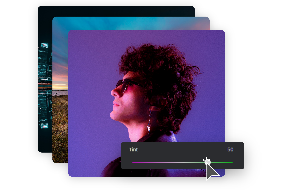
Edit Image Backgrounds Colors
Instantly change background colors to match your aesthetic, from artistic portraits to professional headshots.
Creative Twists for Online Image Color Change
Create Engaging Social Media Content
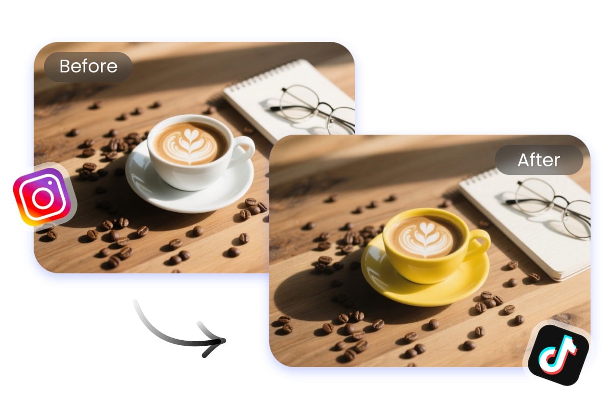
Stand out on social feeds with creative edits. Use our photo color changer to change image color online free, apply new tones, or refresh old pictures. The online image color change feature gives influencers and marketers endless ways to craft eye-catching content that grabs attention.
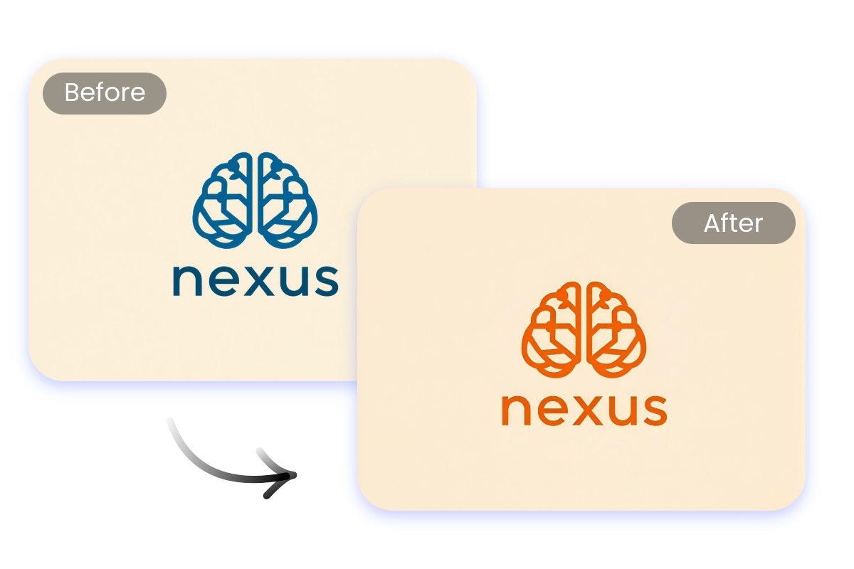
Keep Logos and Branding Consistent
Ensure brand consistency with our logo color changer. You can change logo color online to match campaigns, backgrounds, or seasonal palettes. This image colour changer online makes it simple to update assets while keeping a unified look across websites, ads, and social media.
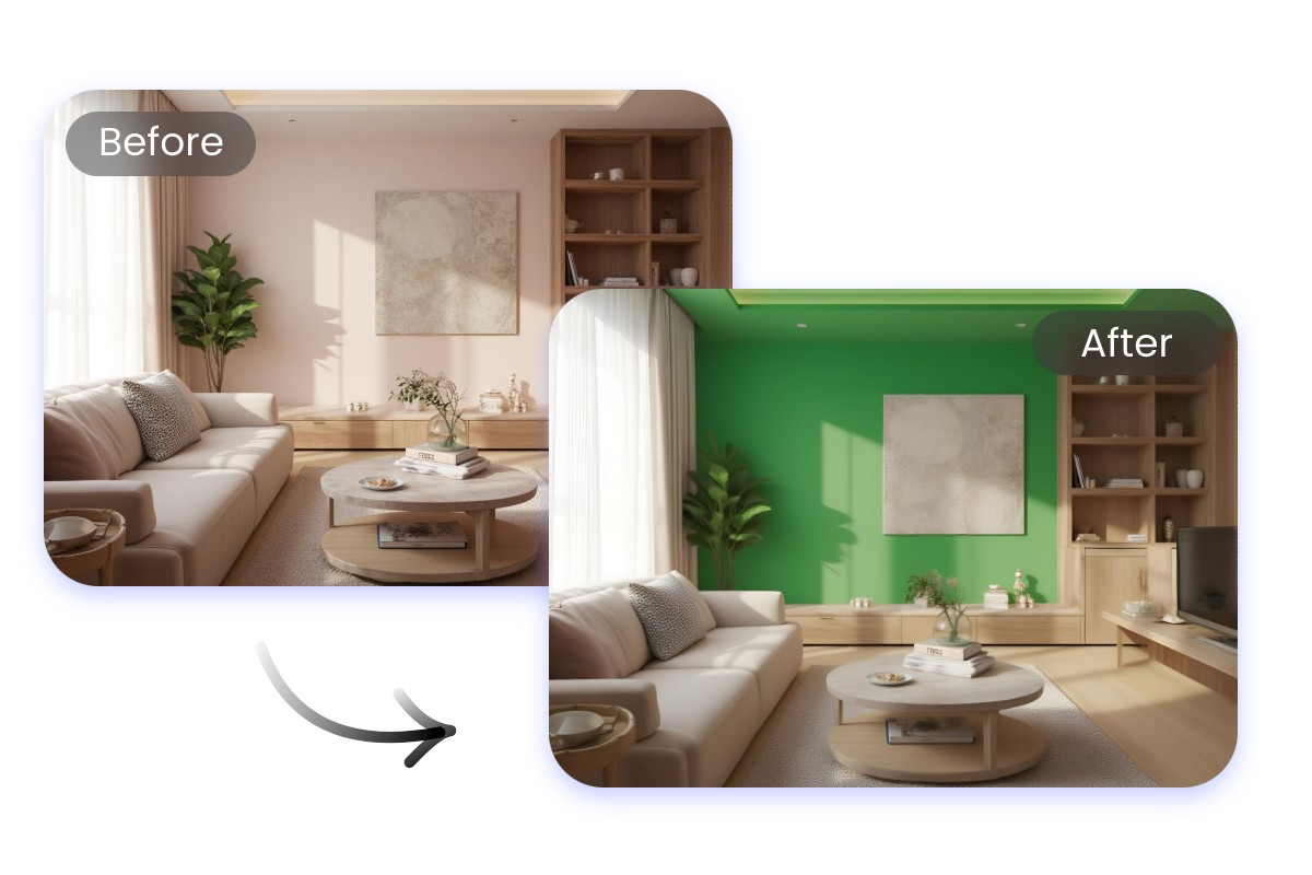
Make Real Estate and Interior Design
Make design ideas more convincing by using the image color editor to preview different wall, furniture, or house décor. With this online image color changer, clients can instantly see variations and pick what fits their vision. It’s the easiest way to present professional interior and property visuals.
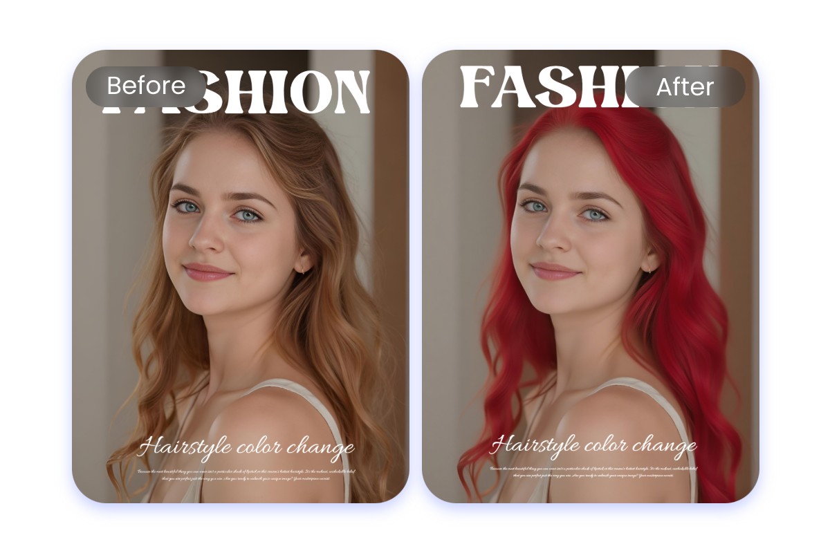
Preview Hairstyles and Beauty Looks
Experiment with styles before trying them out. Use our photo colour change online tool to test hair colors, makeup tones, or highlights. The change color of image online free feature helps stylists, salons, and beauty enthusiasts visualize results quickly without commitment.
Why Choose Fotor Image Color Changer?
![Fast and efficient image enhancement icon]()
Fast and Easy Edits
Change color of image instantly with Fotor online image color change tool with no downloads, no fuss.
![Edit and create visual content through simple conversation]()
Customize Anything You Want
From clothes to logos or backgrounds, you can change color of image online free exactly where you want.
![Export visuals in HD resolution for print or web]()
Professional Results Every Time
Fotor photo color change tool ensures natural and smooth edits, making realistic image color change online results.


What Our Users Say?

Founded in 2009, Fotor has established itself as a leader in image-processing, now serves 600 million users worldwide as of July 2024. The Company delivers innovative image editing and design tools to over 200 countries and regions, including the U.S., Europe, Southeast Asia, and India.
"Fotor Photo Editor enhances the creation of my visual projects"
From the first use I liked the AI tools that besides simplifying photo editing also allow me to generate beautiful and professional looking images (it has a preview before finishing any project to adjust details). I like how interactive Fotor Photo Editor is by having implemented a daily incentive dynamic that motivates me to interact with the community and participate in different activities.
"A Versatile and User-Friendly Photo Editing Tool"
What I like best about Fotor Photo Editor is its user-friendly interface and extensive range of features. It provides powerful editing tools, a variety of filters, and seamless integration across different devices, making it convenient for both beginners and experienced users.