7 Big Graphic Design Trends to Watch for in 2017
Summary: In this blog, we've summarized 7 big graphic design trends for 2017. Pay attention to these trends and level up your graphic design from now on.
As the wild year of 2016 wraps up—crazy, we know—it’s a good idea to start looking forward in the world of design to see what graphic design trends are coming our way. We’ve been dreaming and imagining how we can incorporate stock photos and vectors. into new and exciting design themes. While we’ve seen some great trends over the past year, 2017 is promising to take design to a fresher, bolder level.
Learn how you can incorporate these trends into your designs using stock media from our royalty-free vector and photo library.
- Material design
Material design may just be the biggest and boldest of design trends to really try to grasp and understand. This style guide was created by Google to try and simplify the way designers design and users interact with the Internet. The core concepts of this trend are “material as a metaphor; bold, graphic, intentional; and motion provides meaning.”
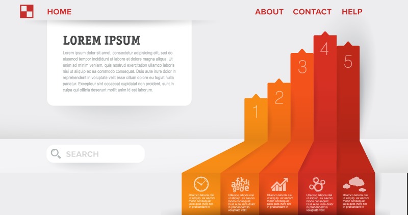
What does all that mean? The visual aesthetic communicates clearly with your user. Draw inspiration from real-world materials—particularly paper and ink—to keep your designs grounded in reality, yet lightweight and minimalistic. Paper is tactile, casts shadows, but is also incredibly flexible. Design with those principles in mind and think about how you’re weaving together the fabric of the Internet.

Be bold with your colors, contrast, and typography. Don’t shy away from imposing a strong hierarchy. Your design should guide the user’s behavior. Utilize motion in your designs—literal and implied—to communicate with your users. Always be thinking: How can I influence my audience to act the way I desire? Google’s Material Design aesthetic is very similar to Flat Design 2.0, but it takes intentionality to another level.
• Bold Photography and Sleek Text
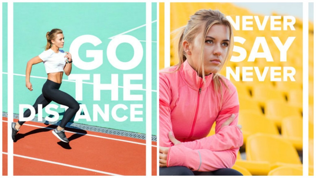
This may be the year of brave designers. Bold photography in coordination with sleek text is gaining momentum as a trend. This combination is often found in advertisements for brands that embrace adventure. Some examples include activewear brands like Nike and also fashion brands like Everlane, amongst many others.
This combination exudes class, yet also excitement. It communicates a clear message, but doesn’t bore the audience. “Bold and sleek” works well for an audience with a short attention span as it gets straight to the point. This combination works great for display ads, social media promotions, and graphics where a small amount of information needs to be conveyed instantly. Incorporate bold borders to better emphasize your information and draw greater attention.
- Modernized Retro
In our recent post about the hottest trends of 2016, we coined the term “Retro Nouveau” in order to distinguish what was commonly known as retro (20s-70s) from what newer retro designs are emulating (80s-00s). However, modernized retro is a whole other ball game. Consider it as a way of simplifying and modernizing any particular graphical element that stood out from any time period of the past.
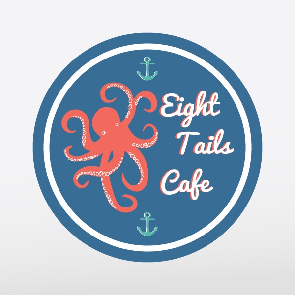
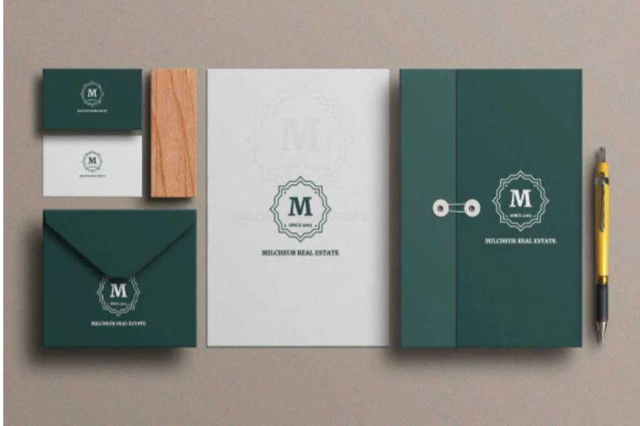
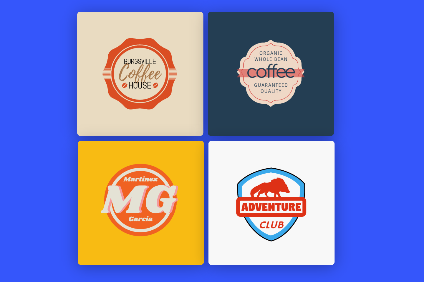
For example, you could focus on modernizing old product labels that utilized badges and flowy script. Or possibly choose to recreate incredibly detailed artwork and icons and choose to scrape them down to their bare essential geometry. Maybe a color palette of the past inspires you—creams, reds, and baby blues, anyone?—and revitalize those little details in your new design. Breathe fresh life into old graphic classics and make something into your own.
- Saturated Colors

Pantone often leads the way with seasonal color trends. In 2017, expect vibrant and bold colors that are incredibly true to their dominant hue. This trend started to sneak its way into a variety of design elements earlier in 2016, but should really pick up speed with the new year. Look for colors found in nature and intensify them. With photography, be bold and up the saturation of your images.

In terms of designing with color, choose loud and deep colors—not necessarily bright. Look for colors that are heavy on the hue rather than brighter in lightness. In your graphic designs, utilize contrasting colors similar to what is suggested in material design. Allow each color to fearlessly draw attention to specific areas of your design.
- Function First
Above all of the previously mentioned trends, function is the key player for 2017. As new technologies emerge like augmented reality, it’s important for designs to be clear about the action that is desired from a user. In fact, utilizing all of the above trends can help achieve this goal.
Utilize the presence of shadows and motion to indicate clear “clickable” portions of your web designs. Bold photography combined with minimal text can help relay an important message that needs to be quickly discerned. Modernized retro can help encapsulate a distinct feeling or sense of nostalgia you wish to associate with your product. Saturated and contrasting colors will draw attention to the most prevalent portions of a design. Think function and clarity in addition to aesthetically pleasing design.
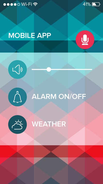
As technology adapts further and further, user experience is a necessity to keep in mind. As a result, many designs will have to be approached with practicality at the forefront of their concepts. Similar to how skeuomorphism helped ease the transition into smartphones and touch screens, designs for new technologies will need to be approached in a way that makes the most sense for new users—which is really all of us.
• Magical Realism
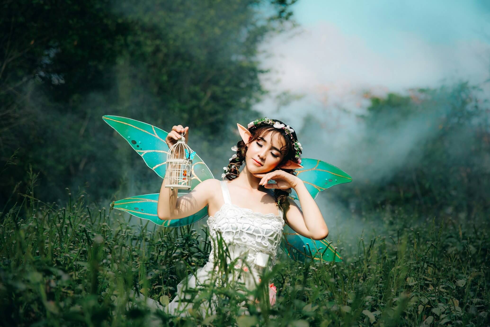

Think you’ve seen it all? Think again. 2017 is not the year to be afraid; it’s the year to push boundaries. If you’re looking for some photos that can really set your designs apart, look no further than these magical realism photos–sure to cause a double-take.
They make an excellent backdrop for graphic posters, social media, and event promotions–really any project that you’d like to feel magical and inspiring. Want to add another touch of mysticism to these works of art? Try adding a grunge texture overlay to roughen them up a bit.
- Social Media Madness
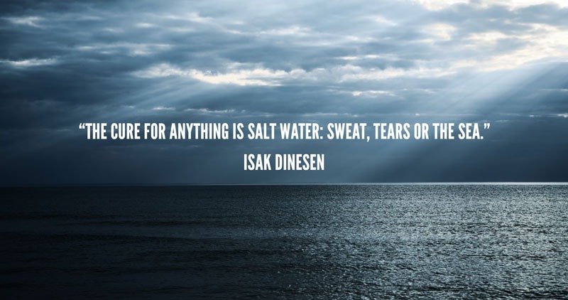
Instagram and Snapchat took over in 2016 and new social media apps are keeping the momentum going into the new year. However, one thing is for sure: social media is more powerful than ever for business. And it’s really not as simple as it seems.
It can be hard to nail down what sort of content will perform successfully. Your social media posts are worthless without captivating graphics. Stock media can provide the perfect backdrop for any variety of social media content. One of our favorite combos? A stunning landscape with a motivational quote to accompany high-performing hashtags such as #motivationmonday, #thursdaythoughts, and #fridayfeeling. Need some help finding your perfect image? Explore our guide to check 11 best stock photo websites.
Are you ready for 2017? Try your hand at designing with these trends using stock vectors and photos. What better way to start the year than with a new creative project?
GraphicStock is a provider of stock photos, illustrations, and vector graphics.
