Free Logo Maker
Quickly create a custom logo that represents your brand with our online logo maker.
Edit and download your logo design in high quality for free. Get started now!
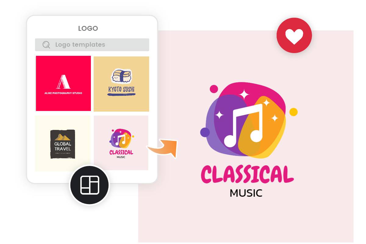
Customizable, Designer-Made Logo Templates for Every Need
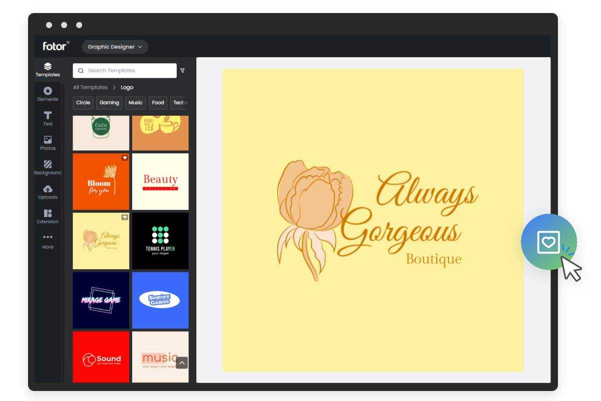
Start a new business and need a brand new logo? Look no further! With a huge library of editable logo templates, you can easily create a logo in no time. From restaurants and cafes to real estate agencies and fitness centers, we have a wide variety of logo templates for every business and needs. Everyone can design professional logos effortlessly with our free online logo maker. No design experience is needed.
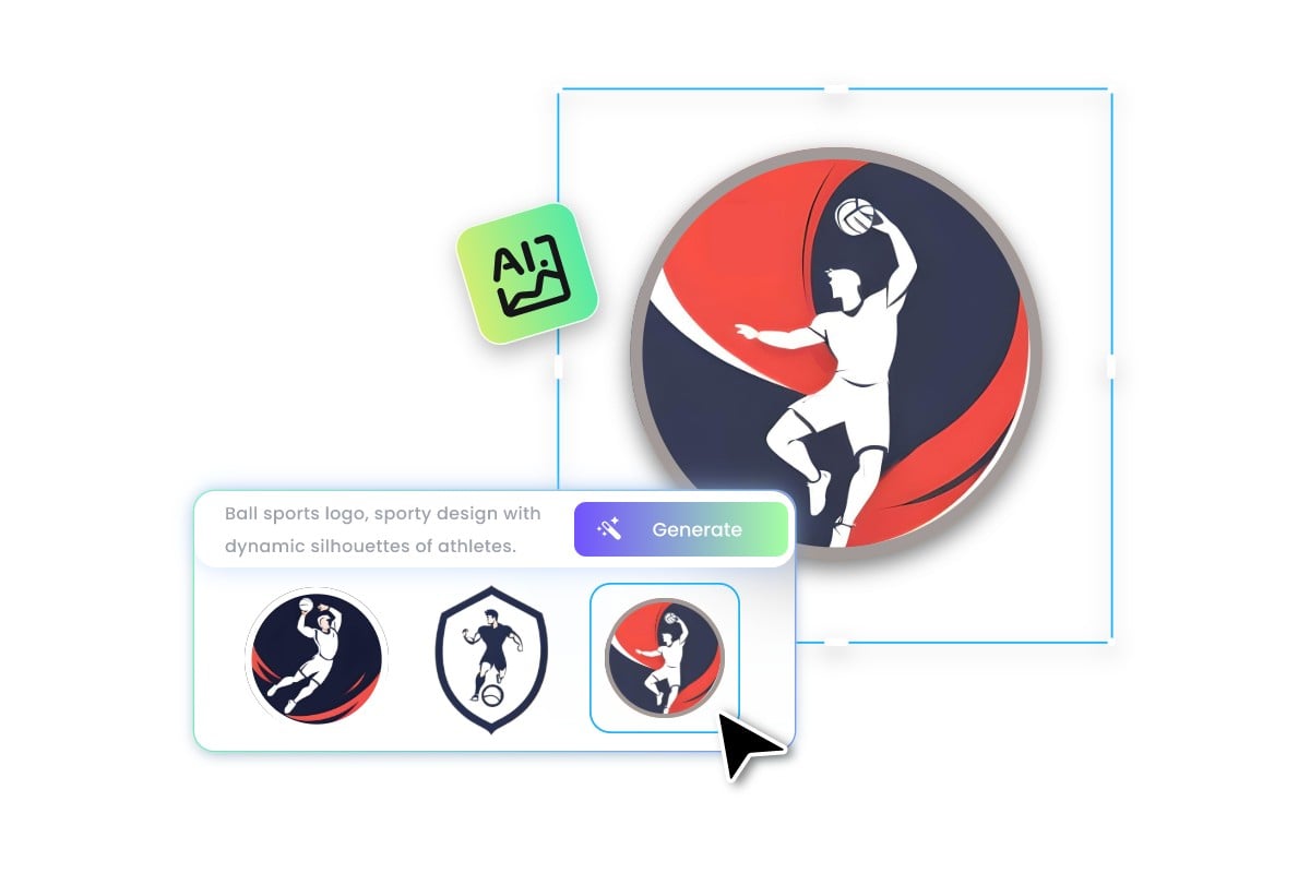
Create a Logo From Text in Seconds With AI
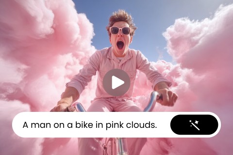
Our logo maker automates your logo creation process. Simply provide a short description of your logo ideas and design preferences, such as the industry, style, and color palette. The AI will analyze the information you’ve provided and automatically generate custom logo designs according to your needs. Whether you’re looking to make a lettermark logo design, mascot logo design, minimalist flat logo design or 3D logo design, we’ve got you covered. Creating a logo has never been easier. Experience the power of the AI logo generator to make a custom logo from text!
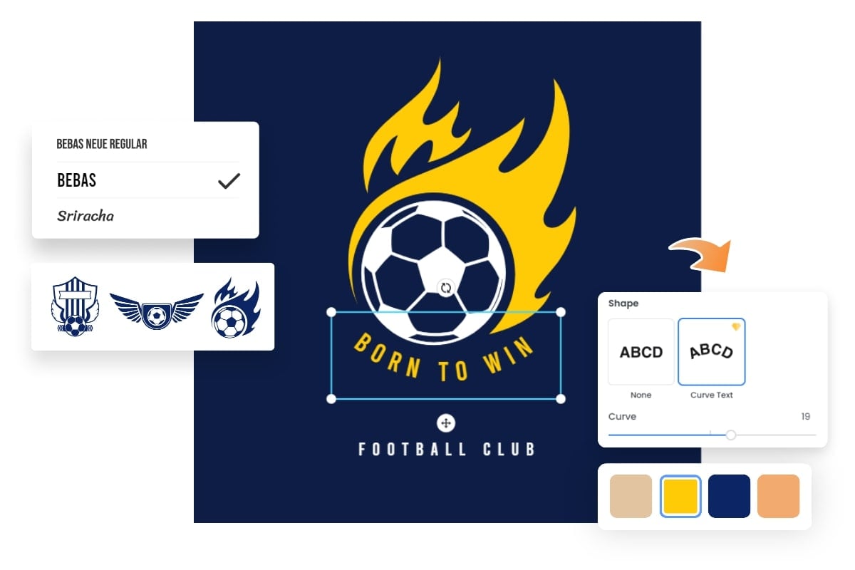
Drag & Drop to Create Your Own Logo Online
With a simple and intuitive interface, you can easily customize every part of your logo design to perfection. Change backgrounds, colors, and fonts, curve text, add new elements, adjust layout, and more. We’ve everything you need to make a logo. You’ll have access to countless icons, images, shapes, fonts, and other design elements to enhance your logo design. Launch your brand with a good logo, and make your brand recognizable!
Design a Professional Logo to Strengthen Your Brand
Having a great company logo for your business is important since it is the visual representation of your brand. No matter what your business is and what kind of logo styles you are looking for, be it a food store or a YouTube channel logo, our logo creator will always have some great logo templates for your needs. With Fotor, you can create a custom, personalized logo that is unique and represents your brand the way you want!
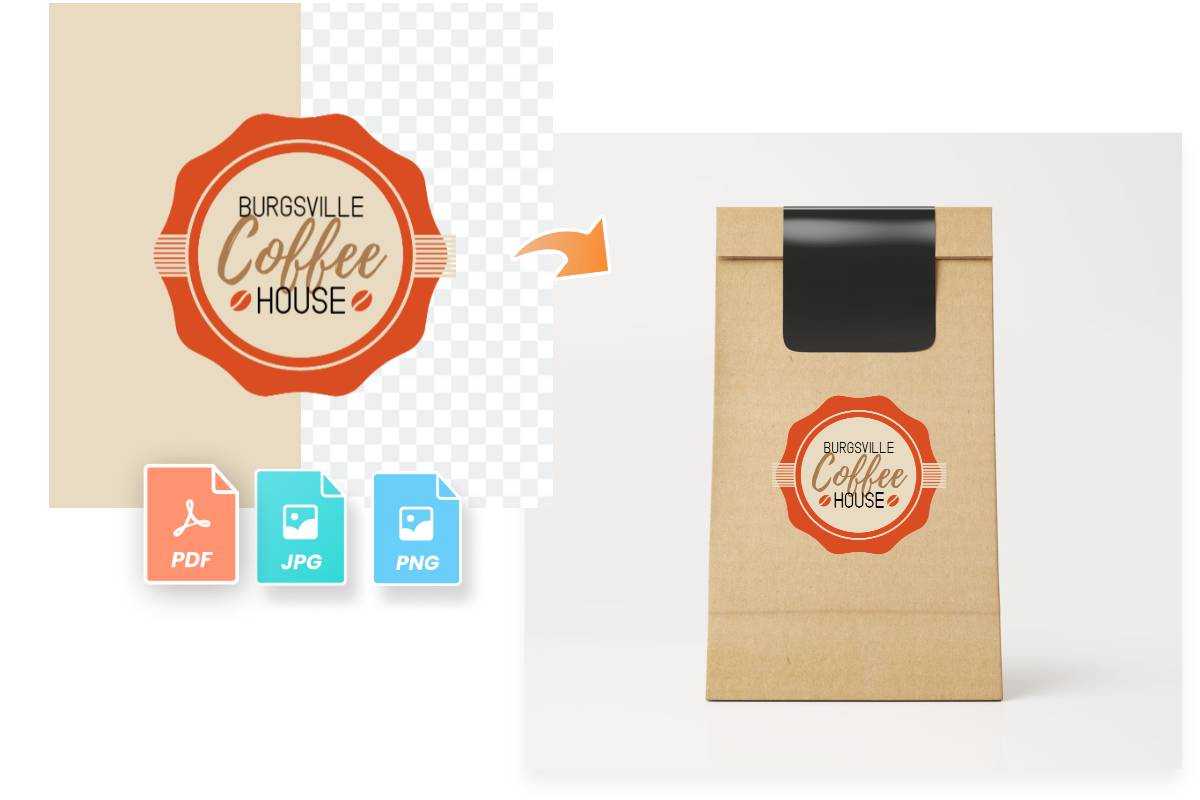
Export and Download Your Logo with High Resolution
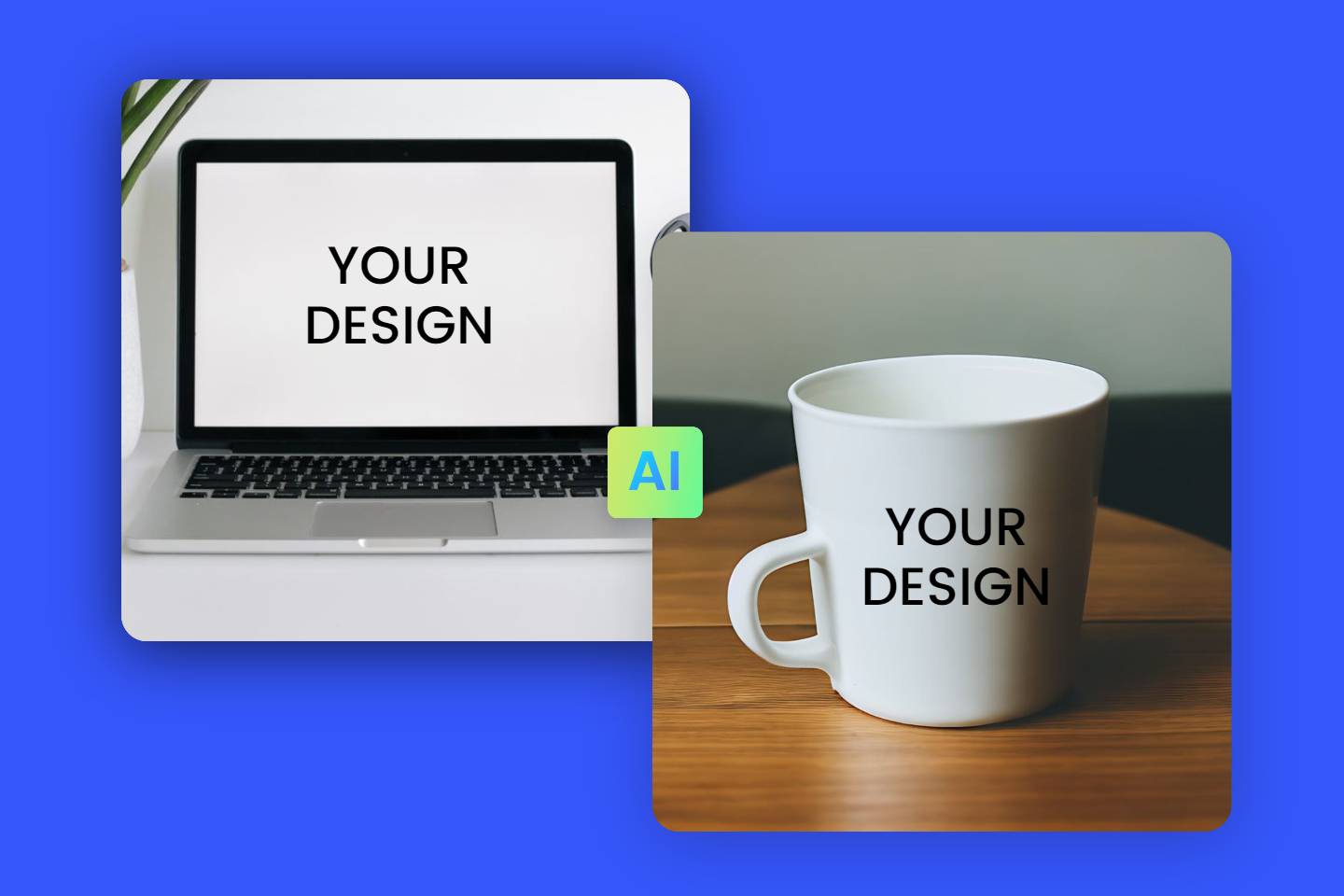
Get high quality logo files that you can download and use everywhere with confidence- JPG, JPEG, PNG, PDF, and more. Need a transparent PNG logo? No problem! Our logo maker lets you export your logo with a transparent background. Effortlessly integrate your logo into any design- websites, email signatures, social media profiles, or printable materials.

Create All Branding Materials You Need in One Place
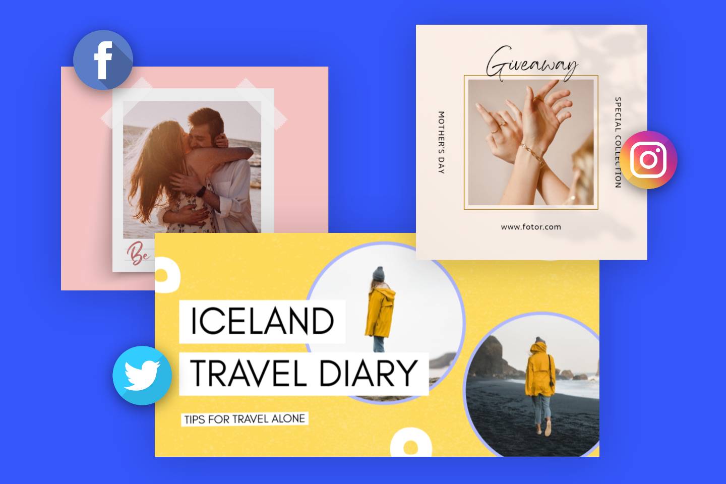
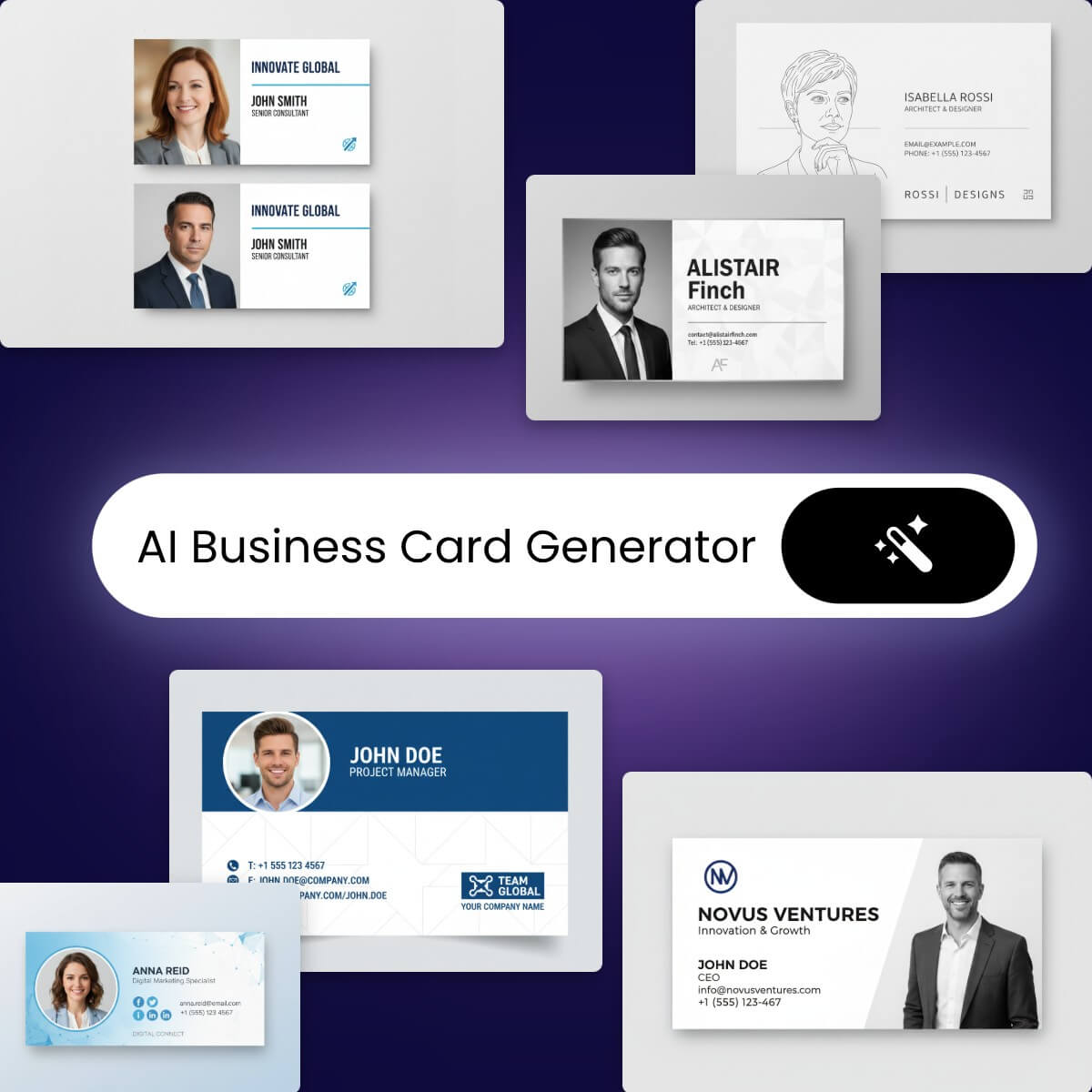
Fotor offers way more tools than just a logo maker. We empower you to create professional designs for all your branding needs. You can create everything from business cards and branded letterheads to brochures and flyers. Get started with Fotor now to improve your presence and create a strong brand identity.
Thousands of Free Printable Logo Templates for You
Browse our logo design ideas and examples for inspiration. Get ready to make a logo for free.









Create a Company Logo in a Snap With Our Powerful Logo Creator
![Easy to use]()
User-Friendly Editor
Our drag-and-drop logo creator makes it easy to make and edit a logo. No design experience is needed.
![High quality templates]()
High-Quality Logo Templates
A wide variety of logo templates to choose from, covering different industries and styles.
![AI powered logo generation]()
AI-Powered Logo Creator
Enter text prompts to describe your logo, and watch as our AI generates endless custom logo designs for you in just seconds.
![Effortless customization]()
Logo Customization
Tailor every element of your logo, from color and font to shape and element. Reflect your brand's aesthetic and tone perfectly.
![Design asset library]()
Fonts and Visuals
Make your logo design pop with a library of fonts, icons, shapes, and graphics.
![High quality output]()
High-Quality Outputs
Export your logo design in high-resolution files- JPGs, transparent PNGs, or PDFs. Perfect for online uses and printing.


