


AI Poster Generator vs. Traditional Design Methods
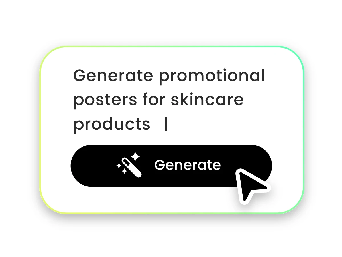
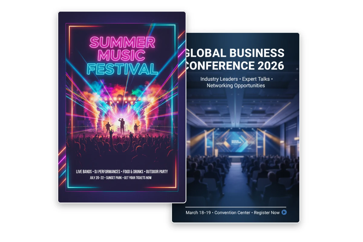
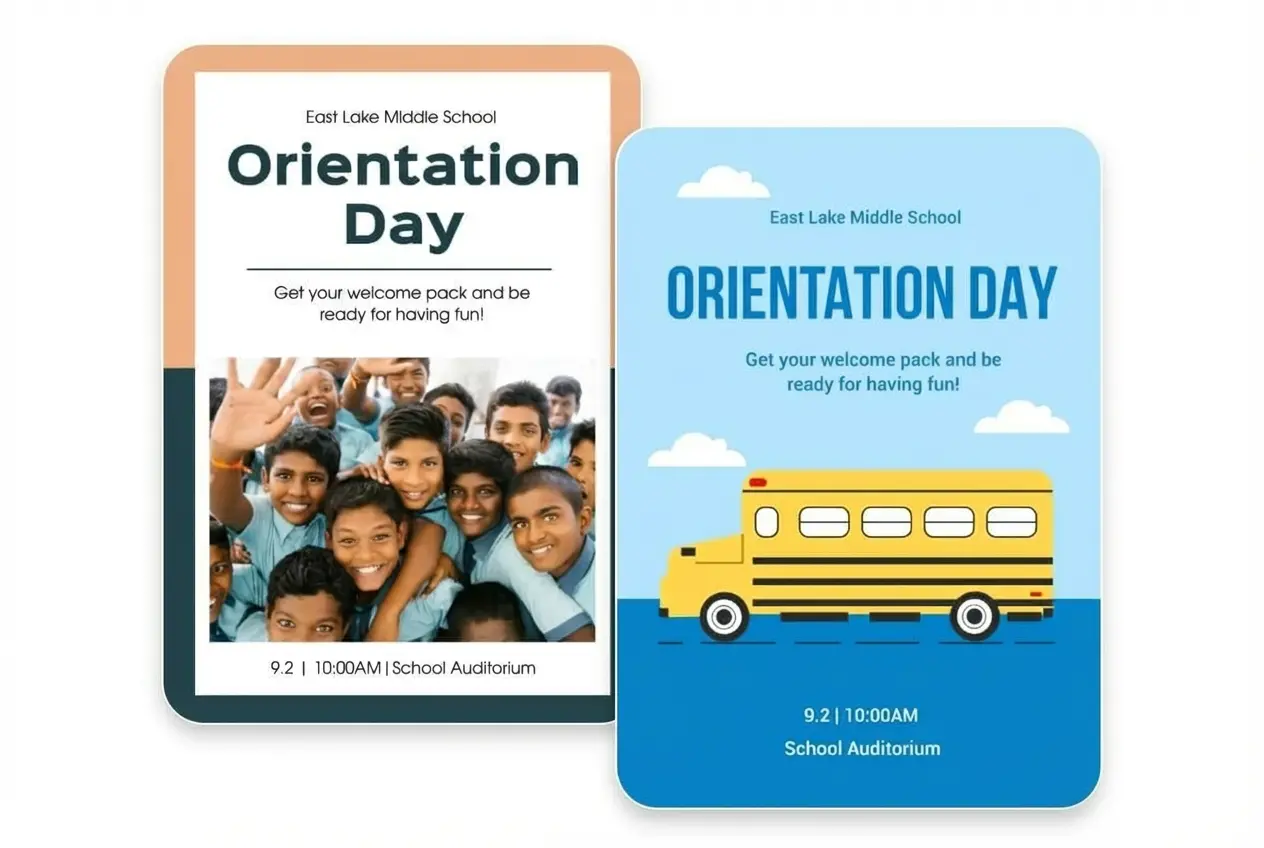
Fotor AI bridges the gap between static templates and complex pro software, offering infinite originality at instant speeds.
| Feature | Fotor AI Poster Generator | Traditional Templates | Professional Software |
| Creativity | Infinite (Unique AI art) | Limited (Same as everyone else) | Infinite (Manual creation) |
| Speed | Seconds | Minutes (Editing placeholders) | Hours (From scratch) |
| Global Scaling | Instant (Auto 2:3 / A-Series) | Static (Fixed dimensions) | Manual (Complex reworking) |
| Design Skill | Prompt-based | Beginner-friendly | Expert required |
| Customization | Deep (Smart editing) | Surface-level (Text/Color only) | Full Control |