Banner Ads Design: The Comprehensive Tutorial for Beginners to Get More Clicks
Summary: This is a comprehensive guide on banner ads design, including what is banner ad, how to make banner ads, and banner ads tips to help you create striking and eye-catching banner ads to get more clicks and traffic.
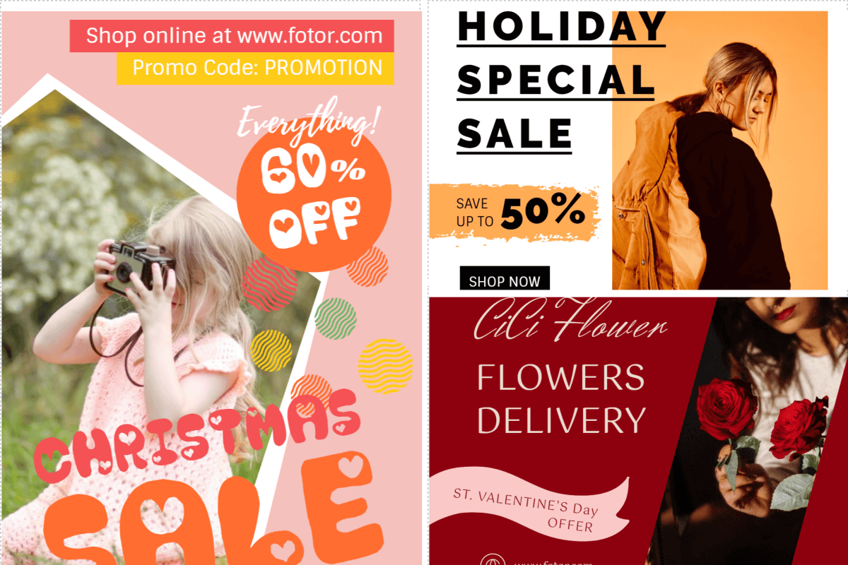
If you have ever browsed the web, you have probably seen one or two banner ads. Usually, banners are placed at the top or on the sidebar of a web page. Since the beginning of the Internet era, banner ads have been a pillar for companies who want to promote their products on e-commerce webistes and services, and while it may seem like these small designs are easy to create, it’s not quite true.
Banner ads are getting more and more creative every day. In fact, there are several popular graphic design principles and trends that you should know before creating your own display ad.
In this article, we are going to cover how you can design a perfect banner ad for your marketing campaign including what colors to choose, how to come up with headlines, and incorporating CTA buttons.
As a bonus, at the end of the article, you’ll find a step-by-step tutorial that will let you know how to create a banner ad in Fotor.
What Are Banner Ads?
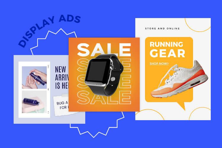
A banner ad, also known as a display ad, is similar to a digital billboard since it uses imagery (hence the term "banner") to attract attention with the goal of driving traffic to the advertiser's site.
Banner ads are placed in high-traffic locations on web pages, creating brand awareness and generating click-throughs, purchases, and leads. These high-visibility locations include the front, bottom, or the side of a webpage; places where the eyes of browsers usually wander.
How to Create Great Banner Ads?
Now,, the question is, how can you design and create web banner ads that will bring more clicks? Below is a general guide and some useful tips for designing amazing banner ads.
1. Choose Your Landing Page First
About 50% of the overall success of your banner ad depends on the landing page used for the promotion. Your landing page could make or break your advertising campaign, so make sure that yours is optimized.
A landing page is, essentially, a web page that visitors see when they click on your banner ad. Most importantly, your landing page should convey the same message as your banner. For instance, if a user clicks on a banner that promises a free webinar, then the landing page should offer a free webinar.
Think about your campaign’s objective when you create a landing page. Do you want people to buy a new product, sign up for a trial, download the free ebook, or leave their contact details?
Additionally, when it comes to the landing page design, think minimalism – less is more. Use beautiful images and videos to attract attention, and make your text clean and readable.
According to BrightLocal, people believe online reviews as much as personal recommendations. That’s why it’s essential to include a few testimonials on your landing page.
Don’t forget to create handy, functional online forms, especially if the goal of your landing page is to collect information from visitors.
2. Perfect Website Banner Size
According to Google Adsense, the standard sizes for banners are:
728×90px – Leaderboard
300×600px – Half Page
300×250px – Medium Rectangle
336×280px – Large Rectangle
Take a look at the banner sizes on the images below:
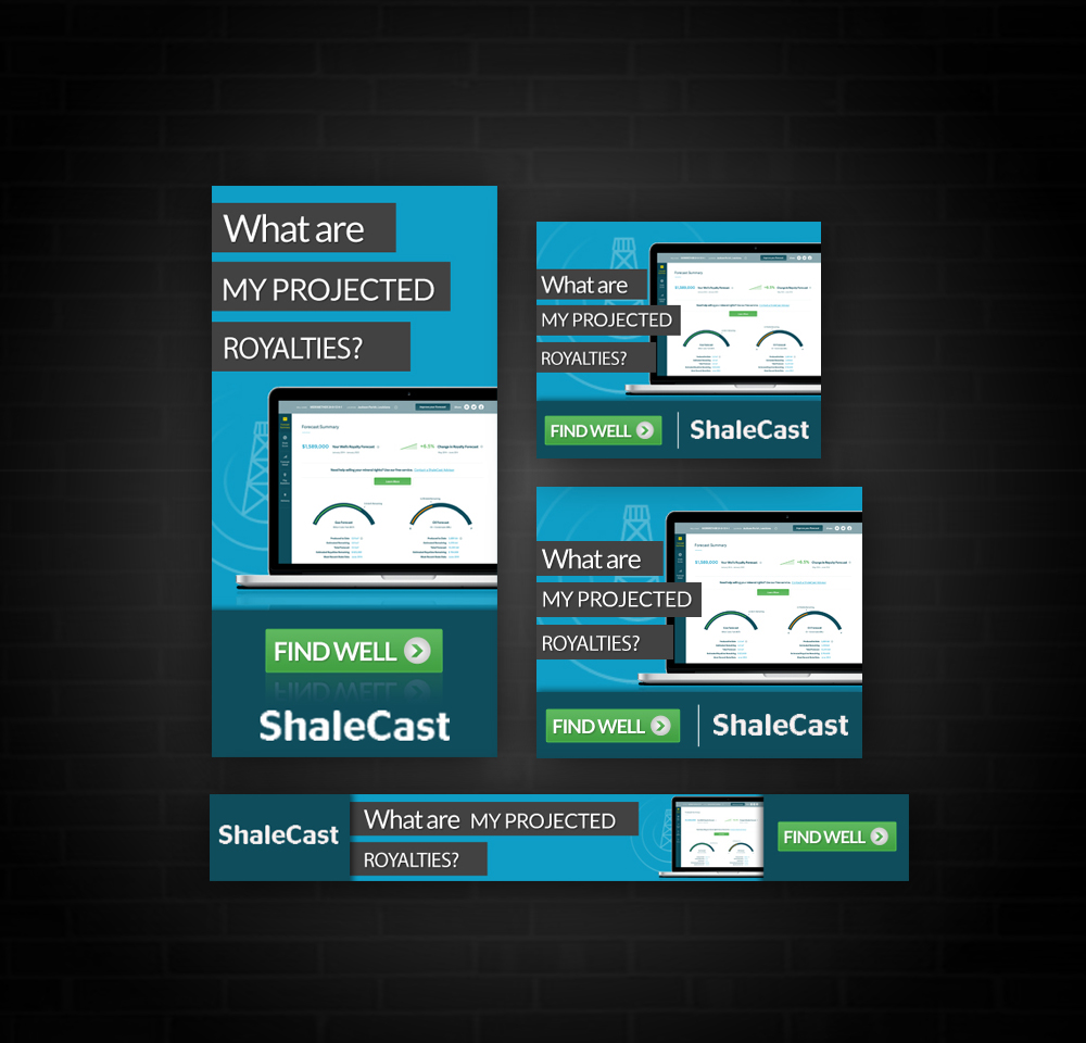
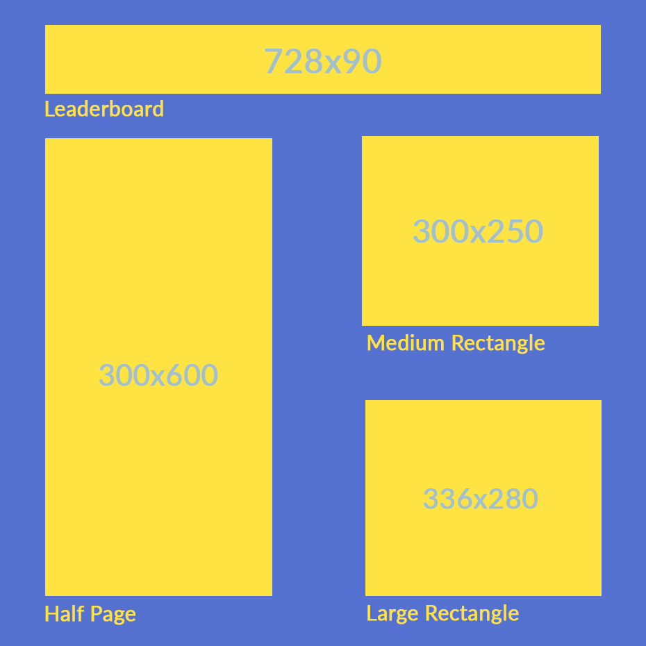
Different Banner Sizes
Stick to these four common banner sizes if you are just starting out with online advertising. Now that you know the actual sizes of banner ads, let’s move on to the design part.
Users should be able to see your banner ad quickly, so it’s best not to use large files. If the banner ad size is too big, it will take a lot of time to load which creates bad user experiences, lowering the number of people who will click on your ad.
Furthermore, people who have a slow internet connection would have to wait for your banner ad to load, again, lowering your impressions. We recommend keeping the file size to the minimum.
Today, there are a lot of image tools that can help you to reduce an image’s size without losing its quality such as TinyPNG.com.
3. Best Banner Background
Generally, most banner ads use two types of background: a color background or a photo.
Solid backgrounds are used when you need to highlight a specific image or text. This will help you to contrast the text, making your message easier to read. If you use a solid backdrop, it should match the product or brand color while still creating lots of contrast against the text.
Finally, color backdrops allow you to create more focus and get rid of distractions. Take a look at this amazing example of a banner ad with a solid background:

The perfect situation to apply a solid background for your banner is when a product has a lot of features. If you don’t use a solid background, you risk overdoing the design, so it’s best to keep it simple.
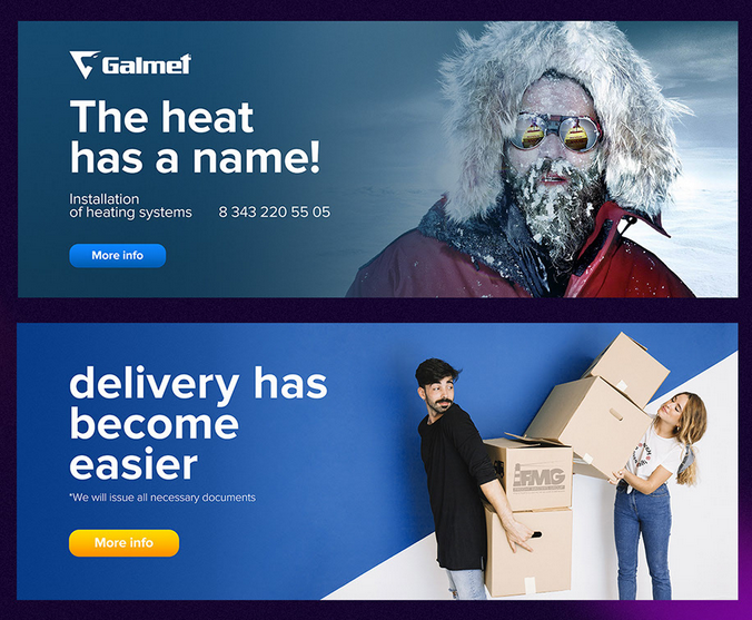
Besides, as seen above for instance, when you feature people on your banner, a solid backdrop is a great choice. Make sure to place a high-contrast button to ensure that your message/text will stand out.
When it comes to photo backgrounds, it’s best to use these when you don’t have a physical product to display. Thus, photo backdrops are the perfect solution for service banner ads.
Choose images that are eye-catching but clean so that message is easy to read. After all, the text should still create a good contrast with the backdrop.
A photo background banner is also good for abstract products. At the end of the day, beautiful imagery is the key to a successful banner ad and driving attention of users.
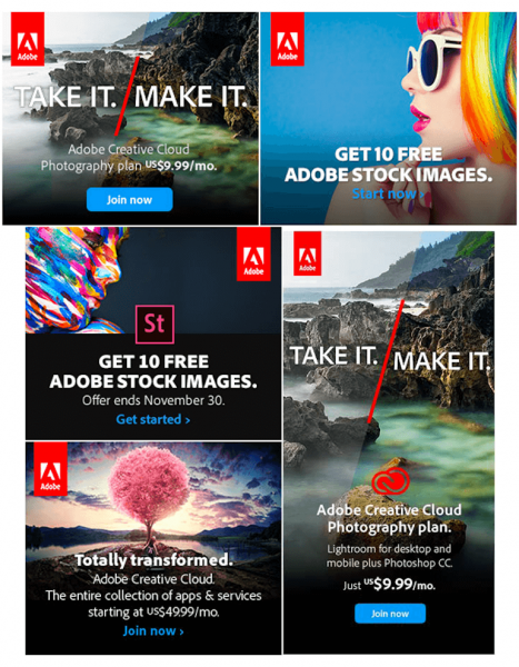
The banners for the company, Adobe, are beautiful, but some of their text is hard to read because some images are intense. Therefore, we recommend that you consider using a hover for your text when you choose an image background for your banner.
4. What Content Should be Included in a Banner?
For your banner ad to be effective, it should include all of the necessary information about your offer while still having a simple, readable design. In this section, we are going to talk about banner ad design best practices.
- Headline
A headline is your offer presented with a large font. This is to ensure that even if you are using a small size banner, the ad could still be clearly seen and readable. Make sure that your headline uses a larger font size than the body text so that viewers can easily distinguish it as a headline.
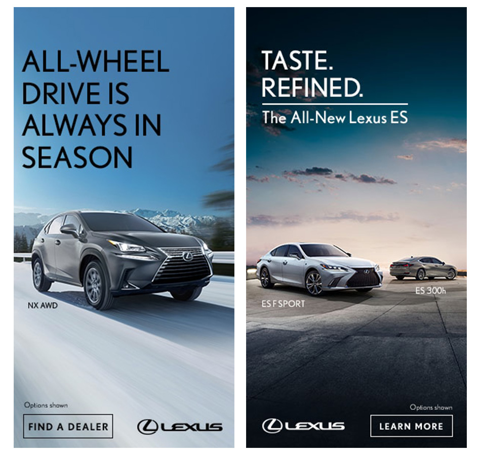
Get your point across in a few words. Keep in mind that you have very limited space for a small banner as well as a limited amount of time for people to look at your ad. Oftentimes, you literally have a second to grab their attention.
Too much text on a banner will make any design overwhelming and dirty. Help users to understand your offer as quickly as possible.
- Photo
Since the banner size is quite small, it’s best to use one image per design. This is because showing every detail can be difficult, especially for multiple objects. For instance, if you run an online store for women’s fashion, showing one piece of clothing per banner will be enough.
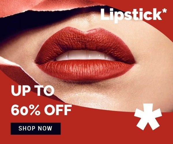
Click this template to edit
- CTA Button
A well-designed CTA button will help you to increase the click-through rate of your banner ad and reduce user friction. Banner Best Practices shows that the best place to include your CTA button is the bottom right-hand side of your design.
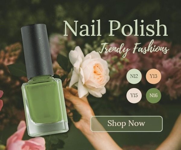
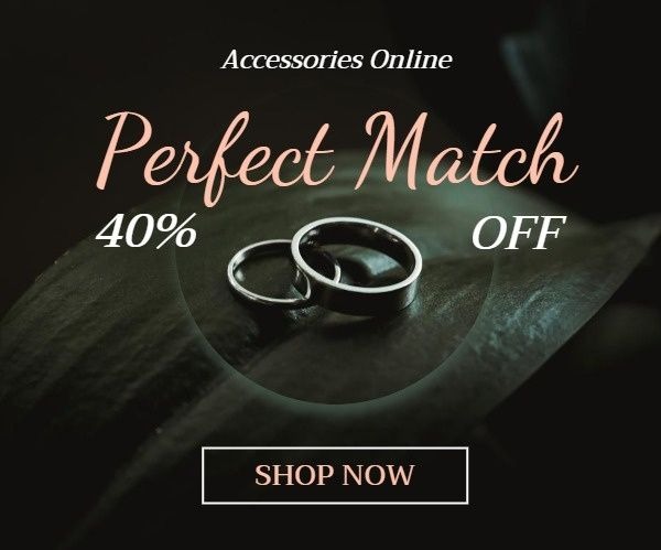
As we have mentioned before, your CTA button should create a lot of contrast with the background and other elements of your layout. To make the button stand out, even more, you can use an entirely different color for the button that you have not used on your banner. See a few banner design ideas below:


Consider the following tips when designing a CTA button for your banner:
- Make the CTA button simple and recognizable. Use the rectangle space (maybe with rounded edges) to create a button.
- Make the button side enough to pace the text that will be readable. Considering using a small banner size and making the text as short as possible.
- CTA button should be rather big along with other design elements.
- Create a sense of urgency with your button’s text by either letting users know that your offer will expire soon or encouraging them to “Sign up Now” to get the “Best Price Today”.
- SubText
If you want to incorporate subtext to further explain your offer, make sure it does not interfere with the heading and the button. It’s better to avoid subtext on your banner unless it’s very short because (as you know) banner size is tiny.
5. Choose Your Colors Wisely
Every color has different associations and meanings (depending on the culture) and causes different emotions. You need to take this into account when creating your banner ad design.
Neil Patel notes in one of his articles that “it is crucial to consider that consumers place visual appearance and color above other factors when shopping”
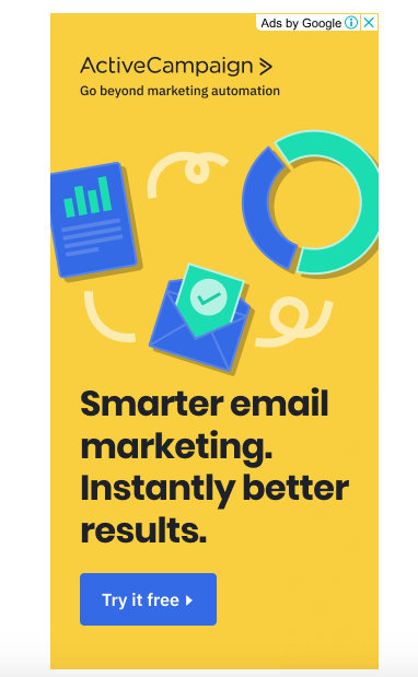
Neil also suggests picking colors depending on the nature of your product banner design. He offers the following suggestions:
– Use orange, red, black, and royal blue to encourage conversion
– Reach people who search for cheaper/affordable products with navy blue
– Soft colors, like pink and light blue, can help to attract women to clothing brands
– Black and gold are good to use for luxury product banners
– Purple is good for magic, femininity, and wisdom
– White color is used to show purity, simplicity, and cleanliness
– Use green to help potential clients relax and show that your product is clean and/or organic
These range of emotions are (typically) recognizable to people in the Western world, but regardless, choosing the right color(s) is a critical step in creating a banner design. You can always pick a few color combinations and run an A/B test to figure out what colors perform better for a particular project.
6. How to Create Banner Ads With Fotor
After reading this guide, you will know the ways that you can create a successful banner ad. Now, it’s time to turn your banner design ideas into practice. In the following paragraphs, we are going to walk you through the process of creating an effective banner ad with Fotor.
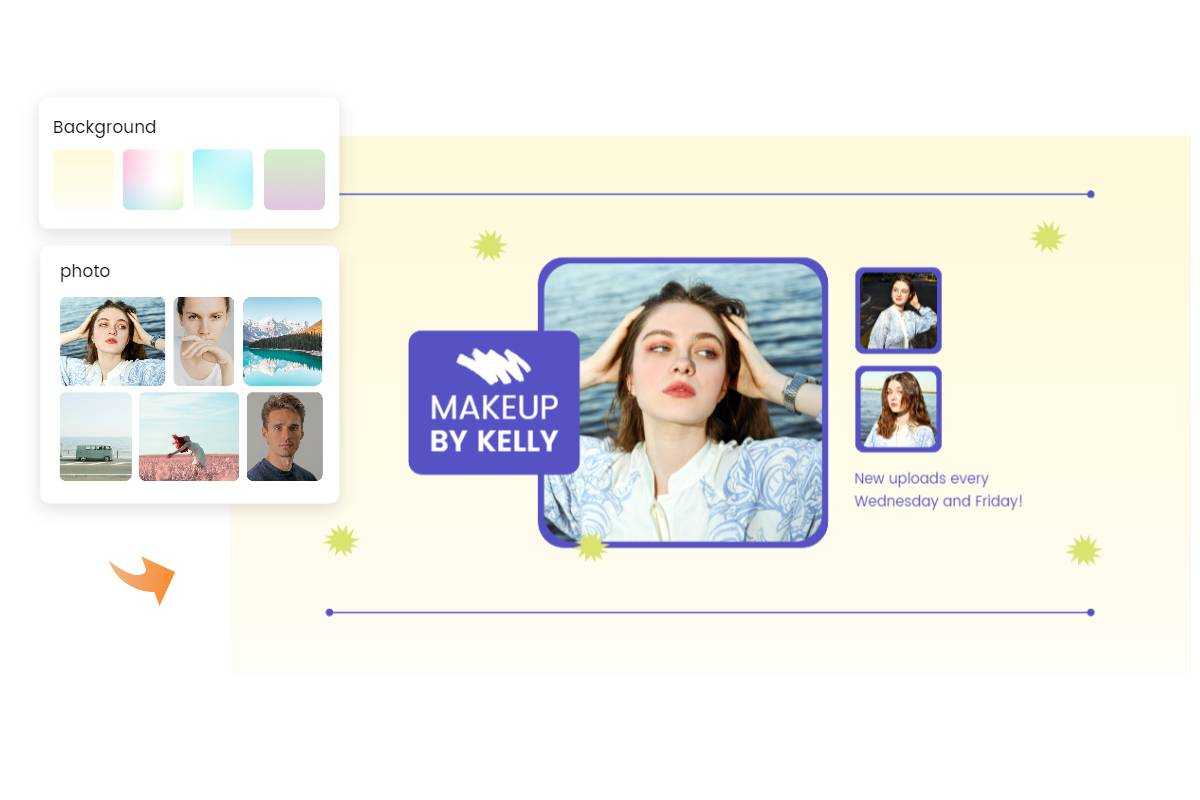
Fotor’s free banner maker offers a wide variety of customizable banner templates to help you create effective banner designs for web pages, YouTube, Facebook, Instagram, LinkedIn, and other social media platforms in just a few minutes.
Besides collages, social media posts, and logos, you can use Fotor as a free banner maker. You can regard it as a banner maker for youtube. It features numerous banner design templates that you can customize in a few clicks. Let’s create a banner ad together.
Step 1
Go to the Fotor website. Locate the menu on top and go to Features – Design – Banner Maker.
Step 2
Fotor offers a lot of banner sizes, including Medium Rectangle (300px×250px), Leaderboard (728px×90px), Large Rectangle (336px×280px), Wild Skyscraper (160px×600px) and more. Choose a size you need and apply it.
Step 3
In this case, you will need a Medium Rectangle banner for your promotion campaign. Click on it to open Fotor dashboard. On the left side of the screen, you will see many amazing, premade banner templates that you can use to start creating your designs.
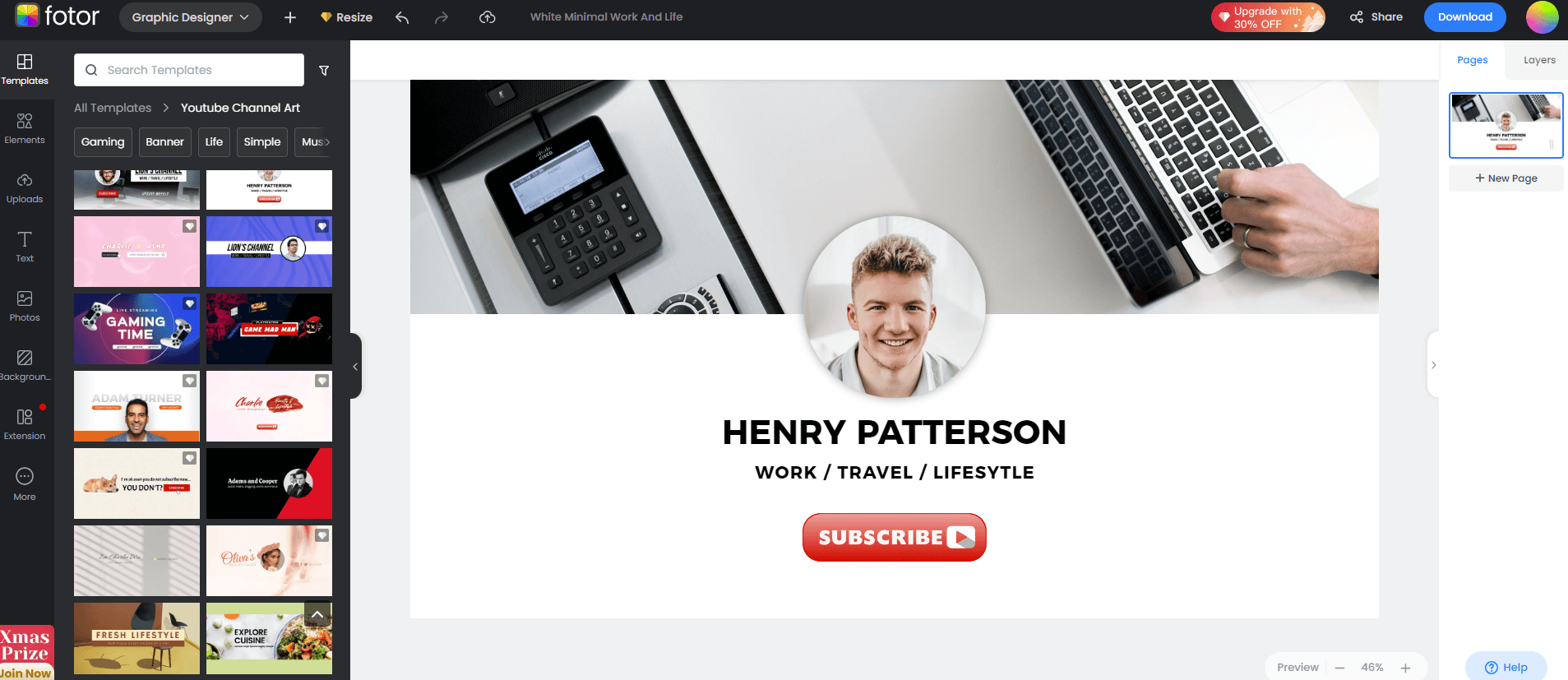
Scroll down and choose the banner that best fits your project and goals. For example, let’s say you want to create a banner ad to notify potential customers and Summer Sale in your clothing online store.
Step 4
First, upload your own image to the Fotor editor. You can upload and try many different photos until you find the perfect fit. Use the Cloud button to upload a photo.
Step 5
Now, change the text on every design element, such as a clothing tag, or a ribbon, and add your own website URL in the bottom.
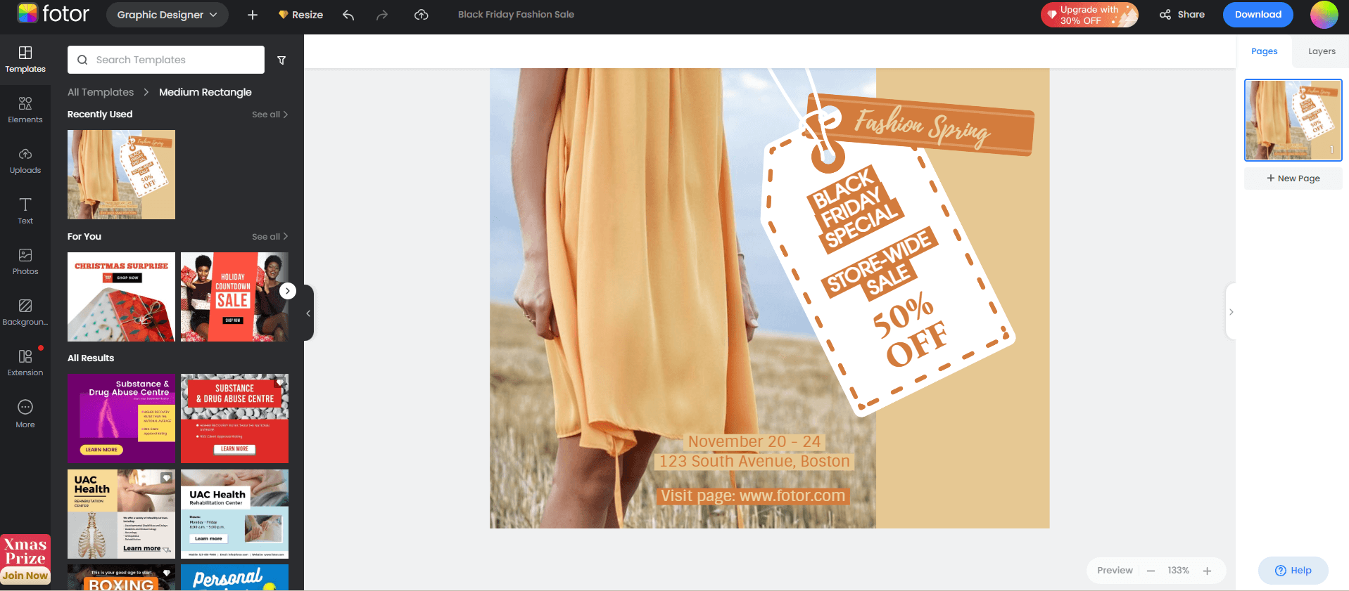
In my case, since I choose a photo with orange details, I won’t change the color of design elements; however, you can customize every tiny detail of the banner including colors, texts, buttons, sizes, images, and more.
Step 6
Check out the final result.
Don’t hesitate to go to Fotor and try to create your own banner ad for free right now. The design can be adjusted to almost any project, and you can upload numerous photos, change anything you want, and create as many banners as you need.
7. Keep it Simple
Don't let your banner design be overwhelmed with two much information. Keep the content and visuals simple and clear. Since most viewers are probably going to look at your banner ads for a second. So, just maintain the most important information so that it can be conveyed to your audience effectively.
8. Keep Your Text Readable
Make your headline and body different font sizes to demonstrate the content hierarchy. For the headline, you'd better use bold font to highlight it. For the body, it must be concise and informative. You can choose any font style you like, as long as the text is clear to read and understand.
9. Use Animation
Animated web banners often can have a better visual effect than a static banner design, but you must ensure that they won't distract from the message of your ad. It's recommended to use simple animations that last less than 15 seconds, and make sure that they don’t loop more than 3 times.
10. Make Your Banner Ads Stand Out
If your banner ad is visually consistent with your web design, this can help you win more viewers' trust. But don't let it merge into your web design too much. Banner ads must always stand out from other parts of the web design so that it can be noticed by viewers.
Warm-up
We hope this guide to designing banner ads will come in handy for you. Now you know all the key principles that make a perfect banner advertising for the web. It’s your turn to create your banner. Don’t hesitate to experiment with different headlines, CTA buttons, images, and backgrounds. The market is competitive and fast-changing, and you need to stay updated about the latest trends. Remember that the best practices about banner ads that we shared are just tips, you need to adjust them to your own brand and project.
