Publish an Email Newsletter and Stay Connected with Your Customers
If you want an inexpensive yet effective way to keep in touch with your customers, publish a newsletter.
Whether you want readers to remember you or buy your product more often, a newsletter is the least expensive and most effective way to promote your business and yourself.
Here’s how to do it with style.
Table of Contents:
- Content for Newsletters
- Newsletter Design
- Newsletter Layout
- Mobile-Friendly Design
- Responsive-Friendly Design
- Typography
- Buttons and Things
- Conclusion
Content for Newsletters
Before we get into the design of a newsletter, it is important to mention the value of content. If your content is good, your readers will not only open your newsletter, they will look for it. They will want to read your content. For that reason, it is important to publish content that informs, entertains, or stimulates discussion in your industry.
Content for a business owner can include the following:
- Updates about the latest developments of their product or service
- Tips/Idears about innovative ways to use their product or service
- Information/Stories about their industry that connect with their readers and, if possible, also connect to their product or service
Email newsletters are also a great way to keep in touch with family. Many people have family members who live across the world. Having a family newsletter can keep everyone updated on the latest family news and be a way for everyone to feel connected to each other. Let’s face it: newsletters are fun.
Newsletter Design
At Fotor, you will find plenty of great templates to help you design your newsletter header. Select Email Header from the Headers and Covers menu and search for a template that appeals to you. Select it and use the text and image tools to customize the header to fit your needs.
A header can have the name of your newsletter, an image that enhances that name, and your logo. Below the header is where you will add your news stories and photographs. Fotor allows you to save your header in a variety of formats including JPEG, PNG and PDF.
(Demo a construction of one or two headers from a Fotor template)
You can complete your newsletter in another program or on a cloud-based service – one that manages your email list is ideal. Simply save your header design as a JPEG and drop it into your layout.
Newsletter Layout
In the last century, newsletters were literally printed letters mailed to subscribers willing to pay a price for information that was specialized and unique. Today, publishers distribute newsletters via email to a variety of devices including computers, smart phones, and tablets. While the content is still specialized, it is not necessarily unique and nearly always focused on marketing. In other words, the modern newsletter is generally an emailed link to a website or purchasing opportunity.
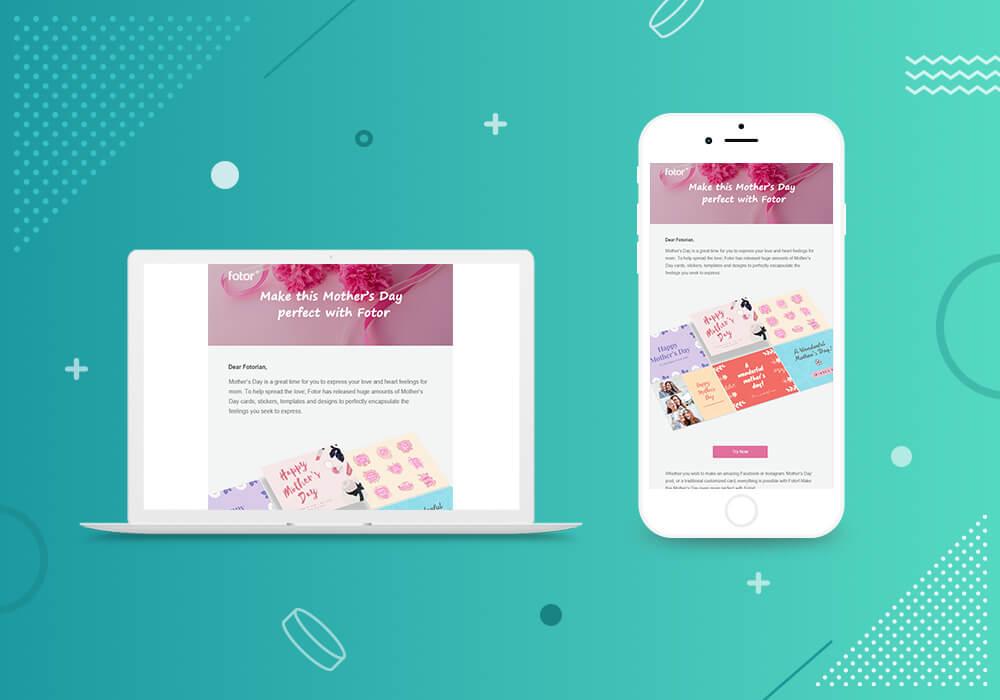
Because the modern newsletter is viewed on so many devices and platforms, it must be designed to be mobile-friendly and responsive. This article cannot go into the details of designing for these two conditions, but it will provide some guidelines.
Mobile-Friendly Design
To be mobile-friendly, a newsletter layout can be designed to a maximum width of 320 pixels which matched the width of most smart phones. Font-sizes should also be no smaller than 16 pixels in order to be readable on these devices.
Responsive-Friendly Design
A responsive design generally adjusts itself to match the characteristics of the device. For example, if the newsletter is going on a tablet, images, font sizes, and other graphic elements adjust to a larger platform. If it appears on a smart phone, the layout may go from a single-column to a multi-column presentation.
Email newsletter services such as MailChimp and Constant Contact generally handle these technical aspects for the user, but if you are creating your electronic newsletter completely on your own, you should understand these concepts and design your product accordingly. It is a good idea to have a working knowledge of HTML and web design.
Typography
Aside from the considerations needed for mobile-friendly and responsive layouts, all newsletters must be readable. Typography is an art form that many newsletter publishers take for granted. Yet, it is the most important element in any newsletter layout.
Nearly all email services have a function that blocks images from senders unknown to recipients. How often have you had to use the “download images” tab in order to see the pictures, buttons, and other design elements in a newsletter? The one element that is not blocked is text. For that reason, the newsletter designer should use fonts that will not be reflowed with default fonts and not make the entire newsletter and image that ends up being a blank screen when blocked by the email service.
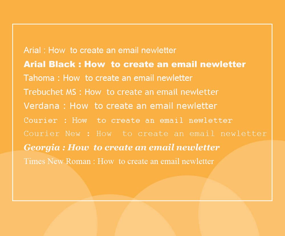
The safest approach is to use the cross-platform web-safe fonts web designers have been using for years. They include, but are not limited to the following:
- Arial
- Arial Black
- Tahoma
- Trebuchet MS
- Verdana
- Courier
- Courier New
- Georgia
- Times
- Times New Roman
While a print designer may complain about the lack of decent choices available for good typography, the truth is that good typography is a tasteful selection of one or two fonts used in combinations of heavy and lighter weights that result in contrast and eye appeal. A skilled designer can achieve it with Arial and Times New Roman. The key is contrast in font weights, no more than two styles of fonts used together, and generous use of white space.
Buttons and Things
As you design your newsletter, be sure to include links that bring readers back to your website. They are a necessity, but there is a difference between a link and a button. Both will take a reader somewhere, but reader perception is different for each.
When you link a word or line of text, readers will usually perceive it as additional information, but a link applied to a button is perceived as urgent – a call to action. For that reason, it is important to use buttons when you want the reader to “Buy Now” or “Sign-up before All Seats are Filled.”
Buttons can be simple or fancy depending on your level of skill and the kind of software you have. Most designers use pixel-based software or draw program to create a fancy custom-made button. However, it is possible to create a button in Fotor using the Basic Shapes tab and saving it as a JPEG or PNG.
Conclusion
In this post, we introduce you ways of making a newsletter design and staying connected with your customers better.
Publish an email newsletter with unique newsletter header templates from Fotor!
Happy newsletter publishing!
